
Designs by Slenco™
For Contest: Elekan Corp
Design Entries
-
#17

-
#21

-
#50

-
#54

-
#55

-
#71

-
#72

Discussion
Slenco™
Designer
Fri, 13 Jan 2012 01:58:33 +0000
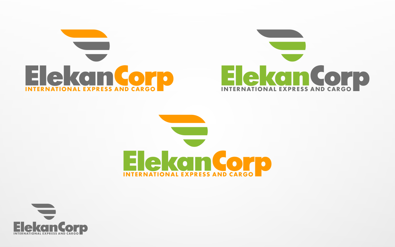
#71 & #72 : try to use fresh soft colors with the same concepts
Slenco™
Designer
Thu, 12 Jan 2012 05:03:14 +0000
#54 and #55 are other alternative designs.
The logo of the two is wing as it represents flying high like a bird, delivering the package safely and fast.
The wing, which consist of three feathers, forms a letter "E" (Elekan).
As a corporation, the bird (the logo) flies to the right which means it can be trusted.
Basicly, the two of them has different style.
#54 is bolder and it has pale color. It gives impression that the company is elegant and looked experienced.
#55 has brighter/sharper color. It gives impression that the company is modern.
Slenco™
Designer
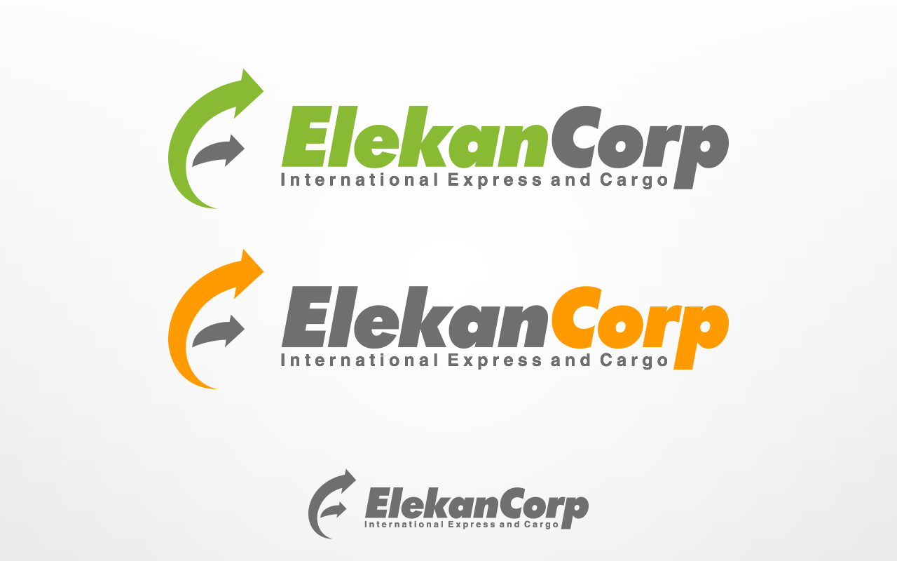
Wed, 11 Jan 2012 00:37:01 +0000
#50 as another alternative design.
I've changed the blue colour softer that it can be flexibly matched with black background.
Also, I've adjusted the letter "E" so that it has same height / in line with other letters, so do with the letter "C".
Not like the previous (#17 and #21), I try to change the font type and the colour of the tag line "International Express and Cargo" into more modern font.
The image file type is PNG so that it has transparent background, so it can be adjusted with another background.
Please feel free to ask me to revise my design.
Thanks
Slenco
Slenco™
Designer
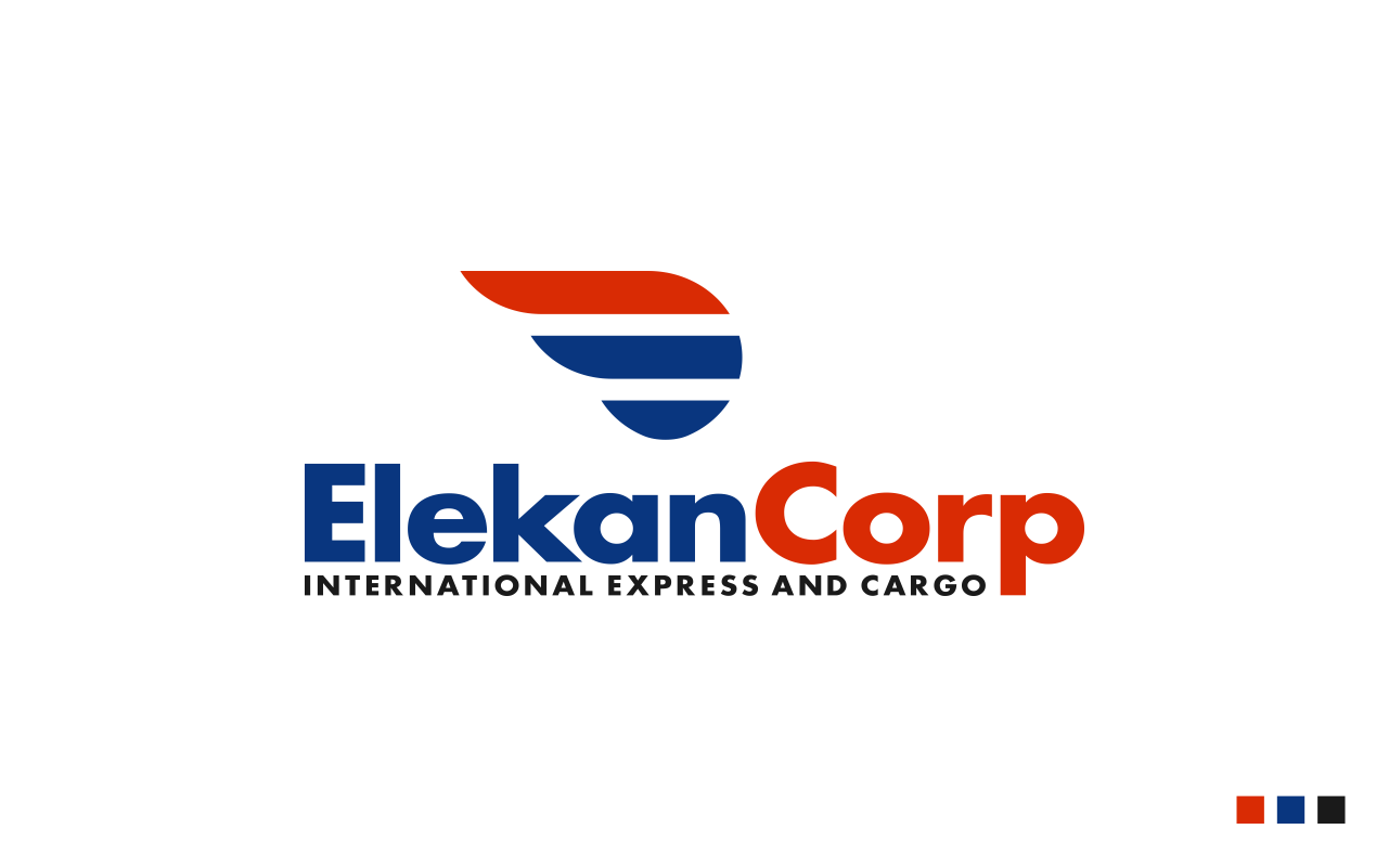
Sun, 08 Jan 2012 10:09:30 +0000
I chose heavy font as it represents shipping cargo.
The blue colour represents trustworthiness and red-orange represents modern.
The italic font and the arrows of the logo represent the moving fast of the delivery.
Lastly, the logo forms combination of letter "E" and "C" which is abbreviation of Elekan Corp.
The blue colour represents trustworthiness and red-orange represents modern.
The italic font and the arrows of the logo represent the moving fast of the delivery.
Lastly, the logo forms combination of letter "E" and "C" which is abbreviation of Elekan Corp.