
Designs by rehaan
For Contest: Front & Back Pamphlet/Brochure
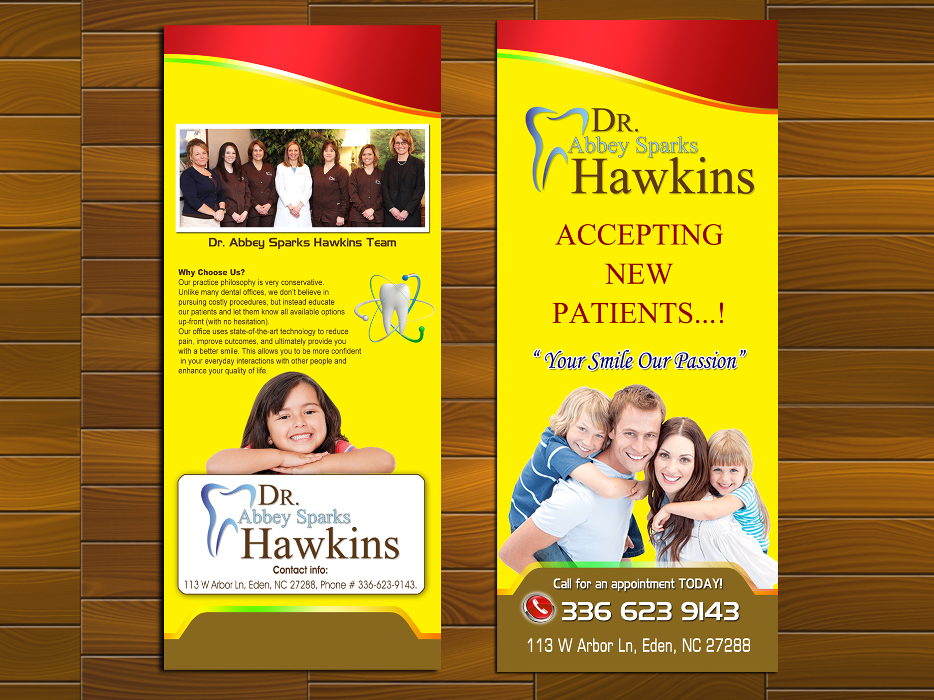
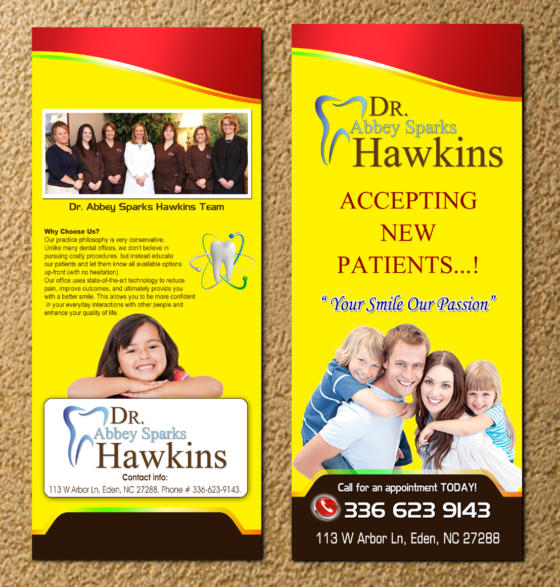
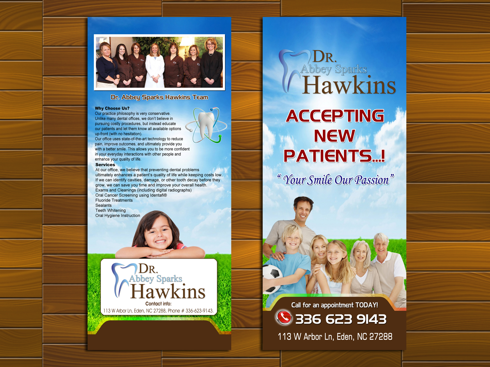
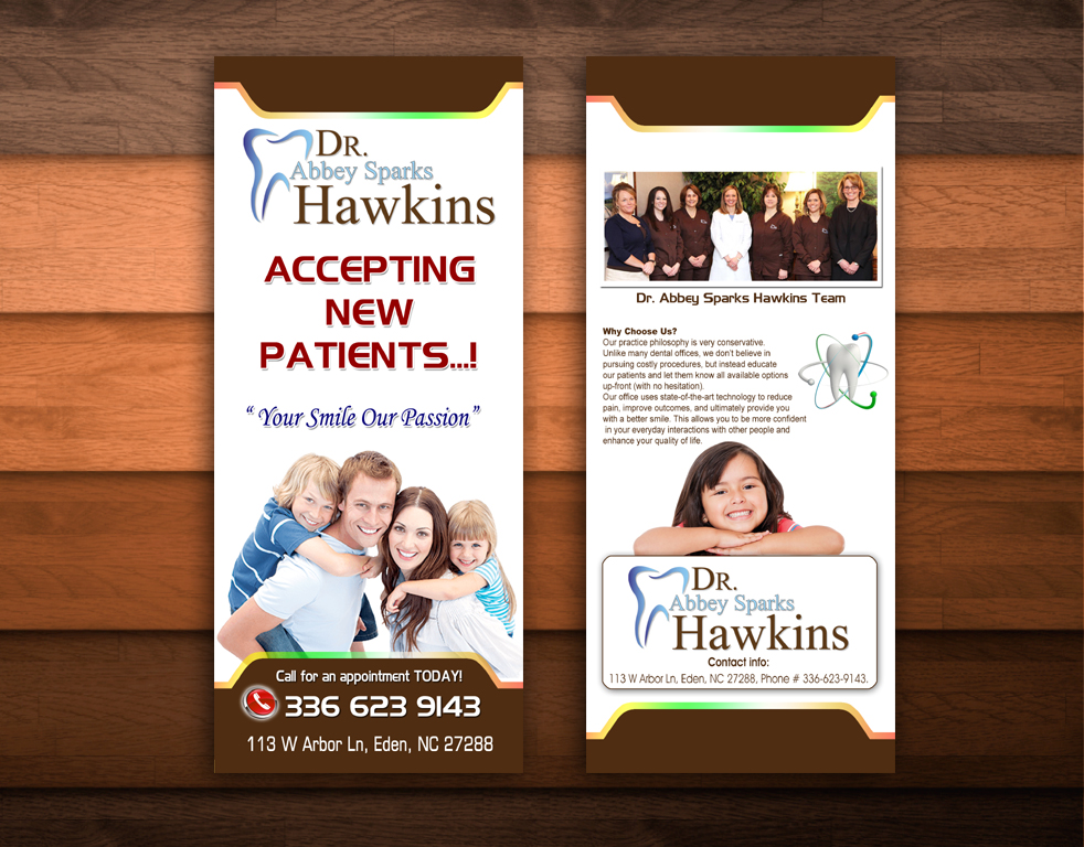
Design Entries
-
#1

-
#95

-
#94

-
#55

-
#36

-
#35

-
#34

-
#22

-
#21

-
#13

-
#12

-
#11

-
#9

-
#8

-
#7

-
#4

-
#3

-
#2

-
#96


Discussion
 hawkinsunc
Contest Holder
Wed, 21 Oct 2015 11:41:57 +0000
hawkinsunc
Contest Holder
Wed, 21 Oct 2015 11:41:57 +0000
I'm not sure the color changes were for the better. Too yellow and still dark.
hawkinsunc
Contest Holder
Tue, 20 Oct 2015 21:12:24 +0000
We're leaning toward design #7. Do this for me: Change the colors around (change the red at the top, the yellow background, and the brown at the bottom to other colors.) I want something that looks more light and airy. The layout is fine, just lighter and brighter. Just feels dull right now. Also, the "Accepting New Patients" font is a bit too futuristic I think...try another one. Save this version though in case I want to go back to it. Thanks.