
Designs by DIC
For Contest: Construction Company Logo Design
Discussion
DIC
Designer
Sun, 15 Dec 2013 12:08:58 +0000
DIC
Designer
Sun, 15 Dec 2013 11:11:28 +0000
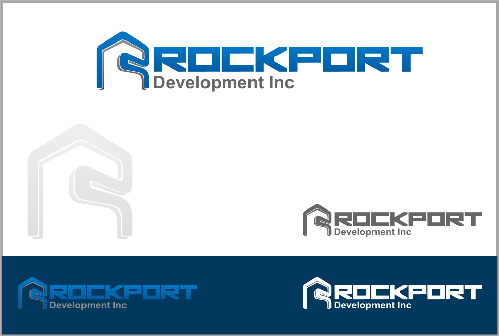
Dear Kevin,
I submit my design for your new logo.
“R” FORMED BUILDING CONSTRUCTION symbolize Rockport Development Inc.
The “R” is the INITIAL of your company.
The construction is your specialty : real estate development company which builds residential and commercial properties.
Blue resemble design and development.
Grey resemble construction, trusted and reliable company.
Regards,
Djoko
DIC
Designer
Sun, 15 Dec 2013 10:54:21 +0000
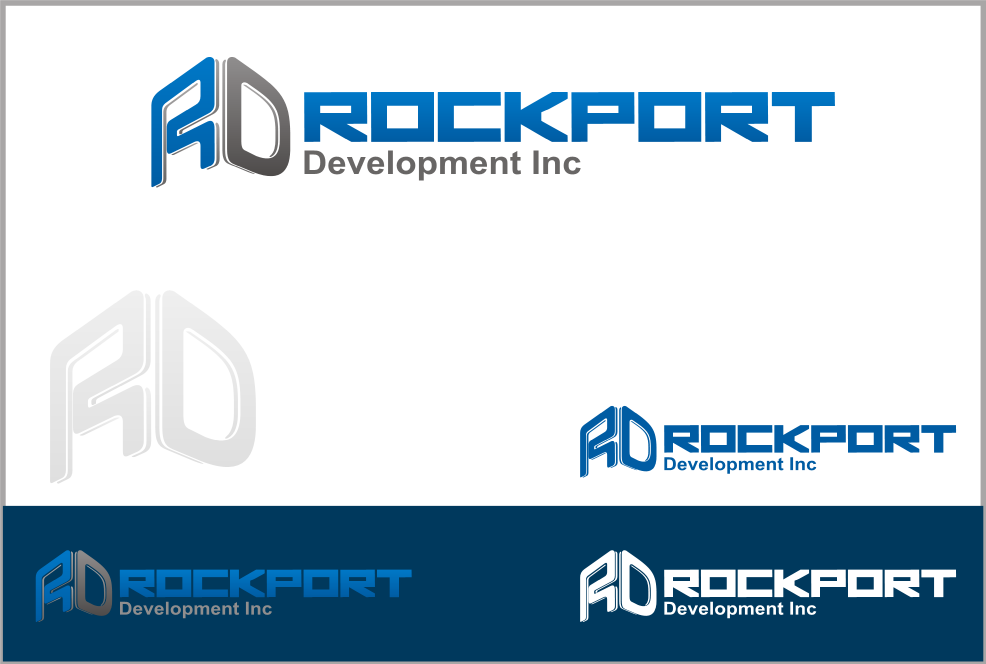
Dear Kevin,
I submit my design for your new logo.
“R” and “D” FORMED BUILDING CONSTRUCTION symbolize Rockport Development Inc.
The “R” and “D” are the INITIALS of your company.
The construction is your specialty : real estate development company which builds residential and commercial properties.
Blue resemble design and development.
Grey resemble construction, trusted and reliable company.
Regards,
Djoko
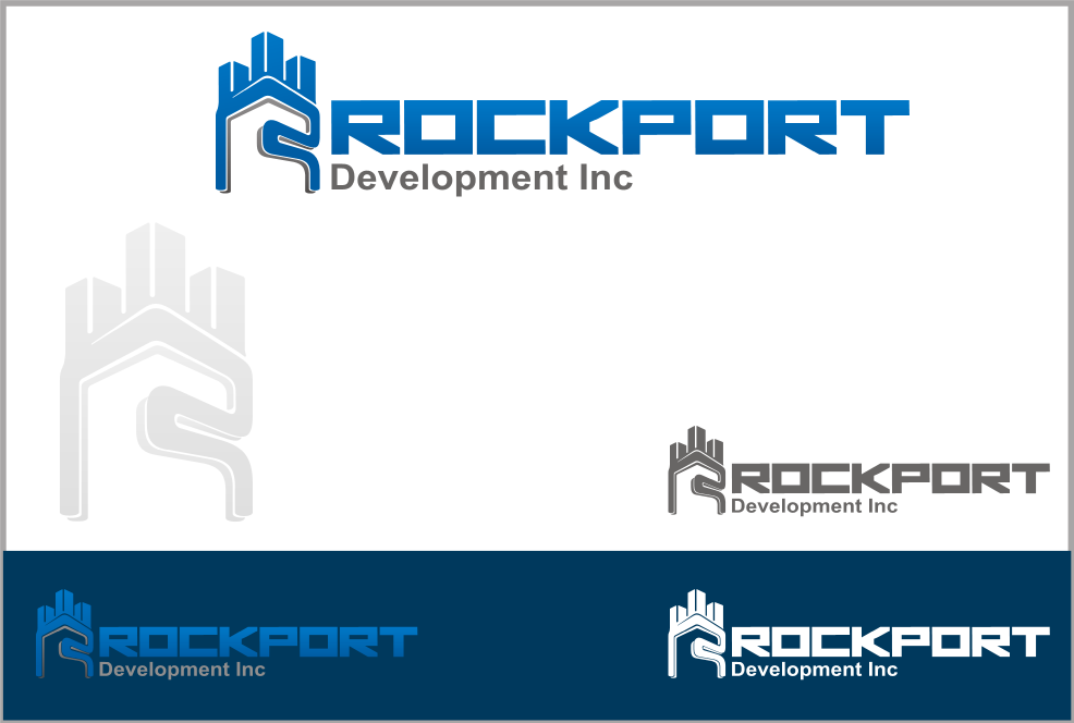
I submit my design for your new logo.
“R” FORMED BUILDING CONSTRUCTION BENEATH 3 BUILDINGS symbolize Rockport Development Inc.
The “R” is the INITIAL of your company.
The construction is your specialty : real estate development company which builds residential and commercial properties.
The “R” beneath 3 buildings resemble STRONG FONDATIONS AND BUILDING CONSTRUCTIONS.
Blue resemble design and development.
Grey resemble construction, trusted and reliable company.
Regards,
Djoko