
Designs by LogoMaster
For Contest: Business Logo Design
Design Entries
-
#56
-
#116
-
#94
-
#93
-
#92
-
#91
-
#90
-
#89
-
#58
-
#57
-
#146
-
#86

-
#85
-
#84

Discussion
Showing last 10 comments - View All
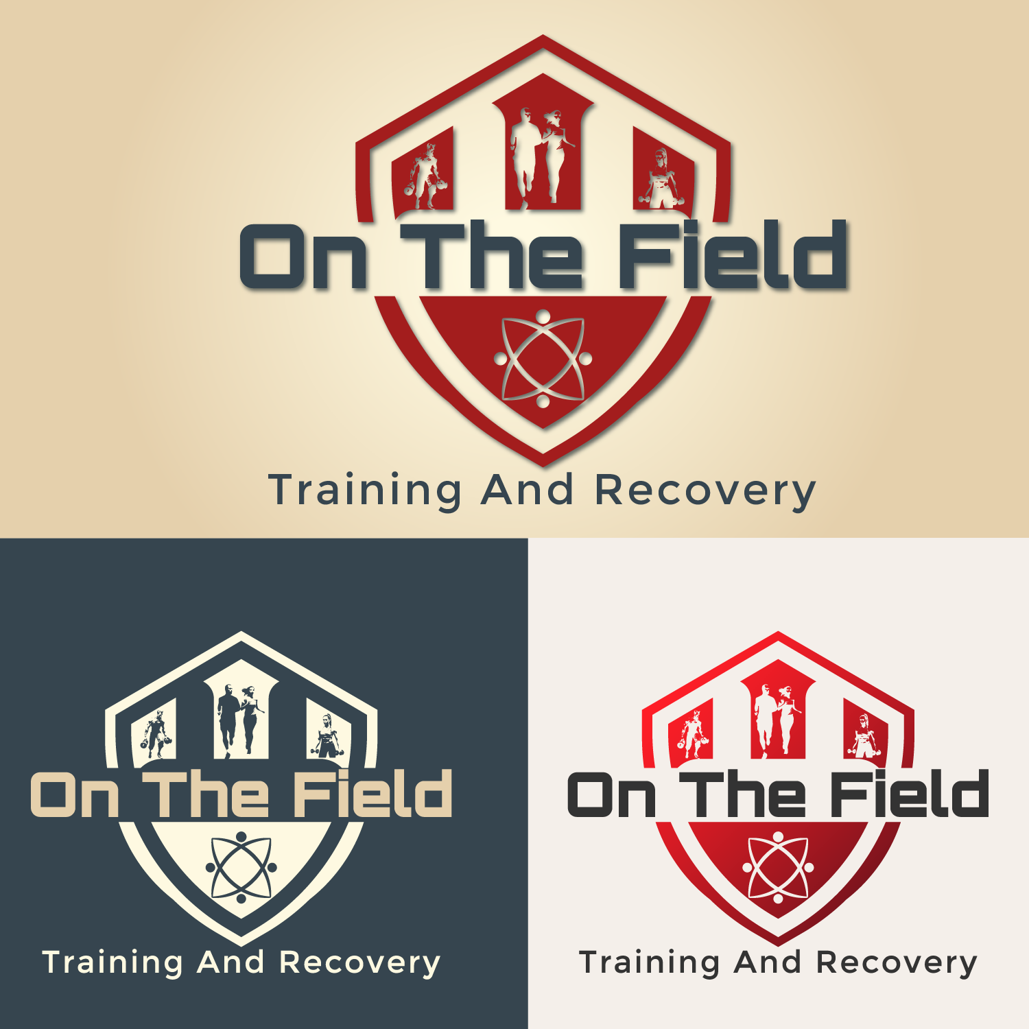
LogoMaster
Designer
Wed, 08 Jan 2025 16:22:55 +0000
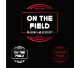
I have tried to imply the ultimate blend of strength, science, and recovery here. Representing resilience and athleticism, the shield design embodies protection and empowerment, while the silhouettes reflect action and progress. The atom symbolizes the science-driven approach behind our training and recovery solutions. A touch of gradient for manifest purposes, but also for the bottom-right logo, the gradient was to stress the awesomeness of our brand.
LogoMaster
Designer
Tue, 07 Jan 2025 16:30:40 +0000
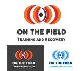
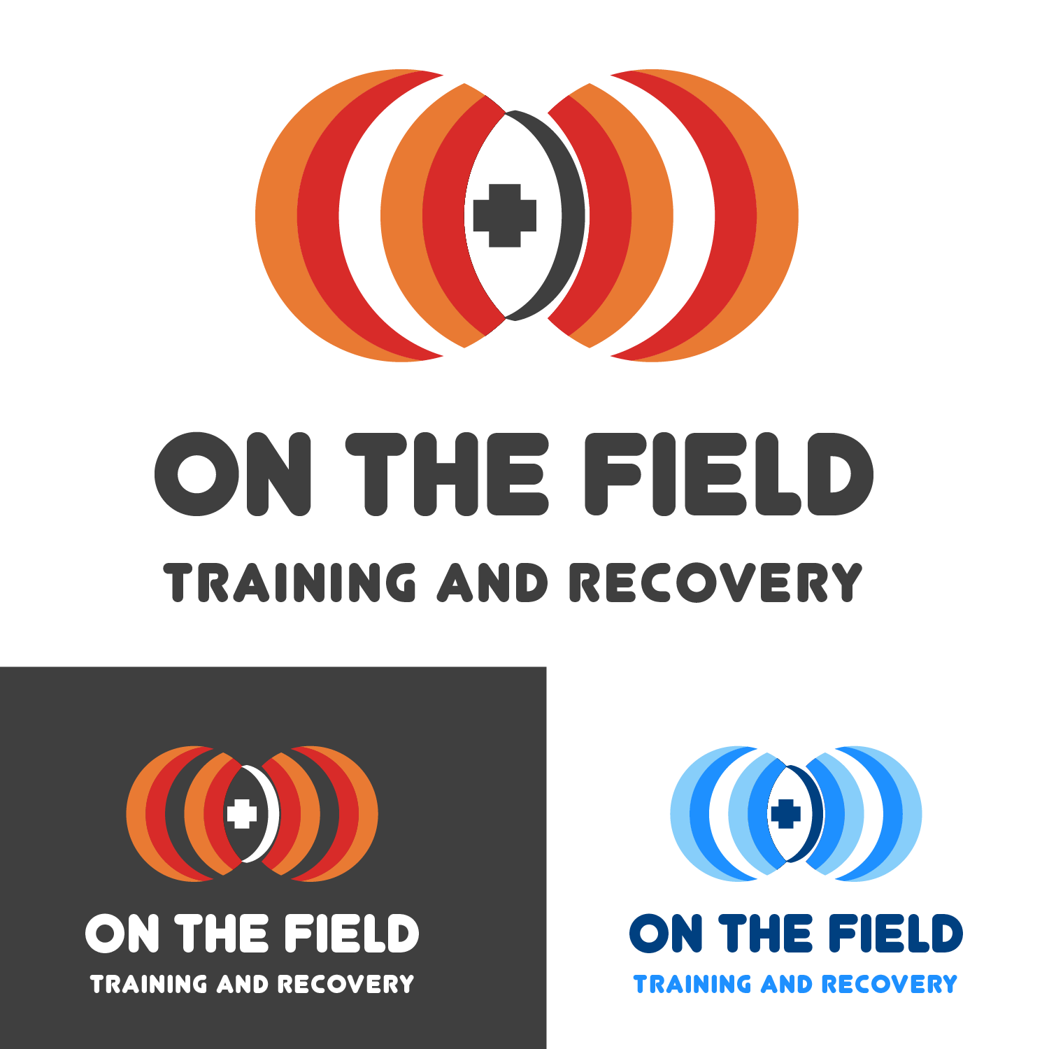
Logo embodies progress, care, and resilience. With dynamic arcs symbolizing motion and energy, paired with the universal cross of trust and healing. Basically, it reflects our commitment to peak performance and holistic recovery. Blue version is always there to evoke trust, calmness and reliability.
LogoMaster
Designer
Mon, 06 Jan 2025 17:09:27 +0000
Just a little tweak for a logo I submitted today. THE in ''on the field'' is played with. Here, in this version of logo, there shows the cross merged with the word THE in the top logo, while for the bottom two, the cross does not exist at all.
LogoMaster
Designer
Mon, 06 Jan 2025 17:00:00 +0000
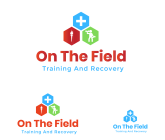
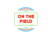
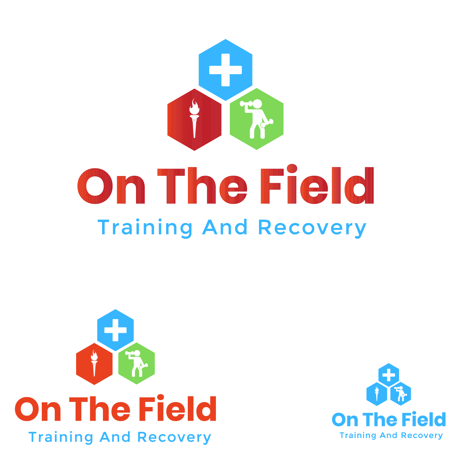
Colorful, vibrant, cheerful, versatile with a touch of gradient, I am happily introducing this logo concept (I had to withdraw three entries before this after just a few tweaks were done actually). Blue will speak to athletes' mentalities in such a reassuring way. Green is just peaceful, red is making abeautiful combination to emphasise the message of our brand. A little red-orange gradient os also noticed, to establish professionalism and seriousness.
LogoMaster
Designer
Mon, 06 Jan 2025 16:22:42 +0000
My same logo with a beautiful red gradient for the fields and beige for typogrphy, with two one-color print-flexible red and white versions.
LogoMaster
Designer
Mon, 06 Jan 2025 16:20:03 +0000
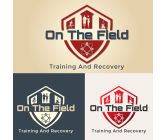
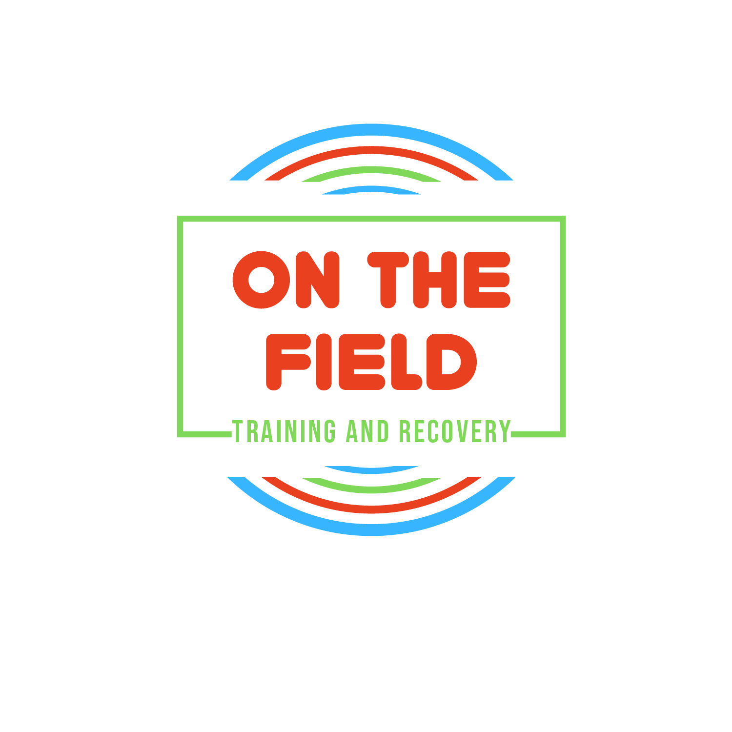
Dynamic, colorful, optimistic, neat, clean, simple logo for the training and rehab centre. slightly loud but still conservative and expressive. a blend of a running field representation and rectagle surrounding the TRAINING AND RECOVERY phrase, that indicates inclusivity, unity, and reassurance. Blue evokes trust, green speaks tranquility, and red makes the statement.
LogoMaster
Designer
Mon, 06 Jan 2025 14:32:55 +0000
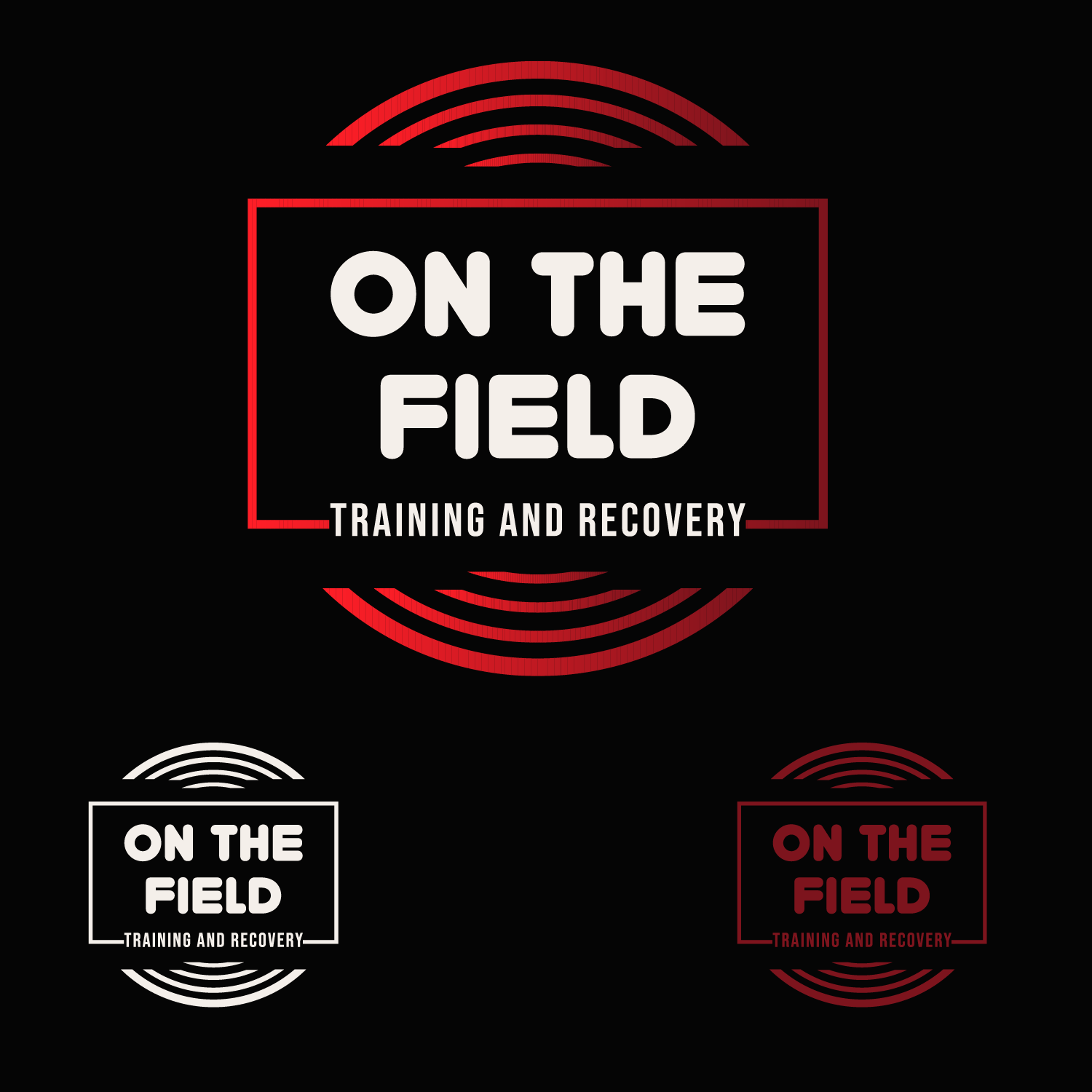
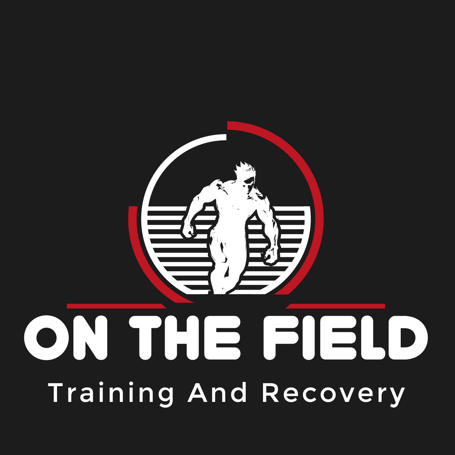
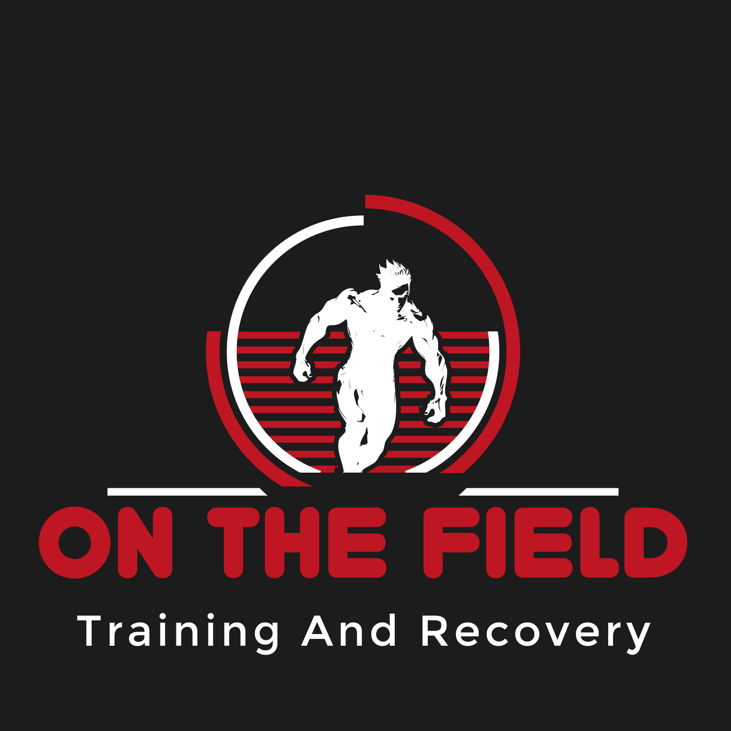
My same previous logo with a new color scheme (srisp white - black - red) on a gradient background
LogoMaster
Designer
Mon, 06 Jan 2025 14:19:00 +0000
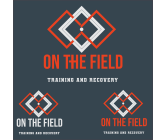
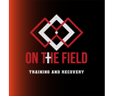
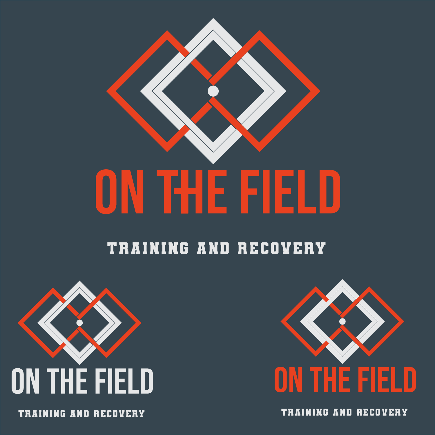
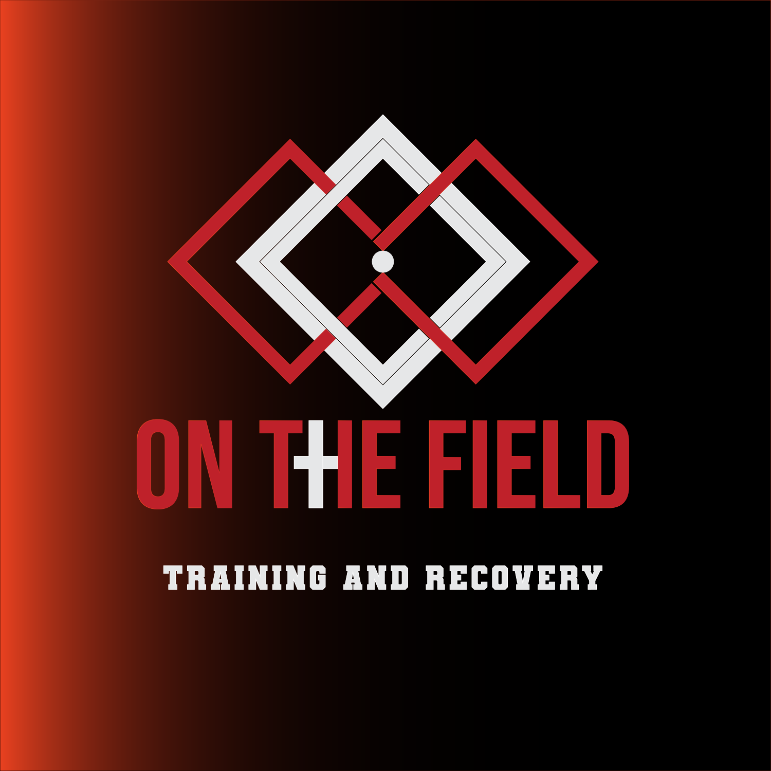
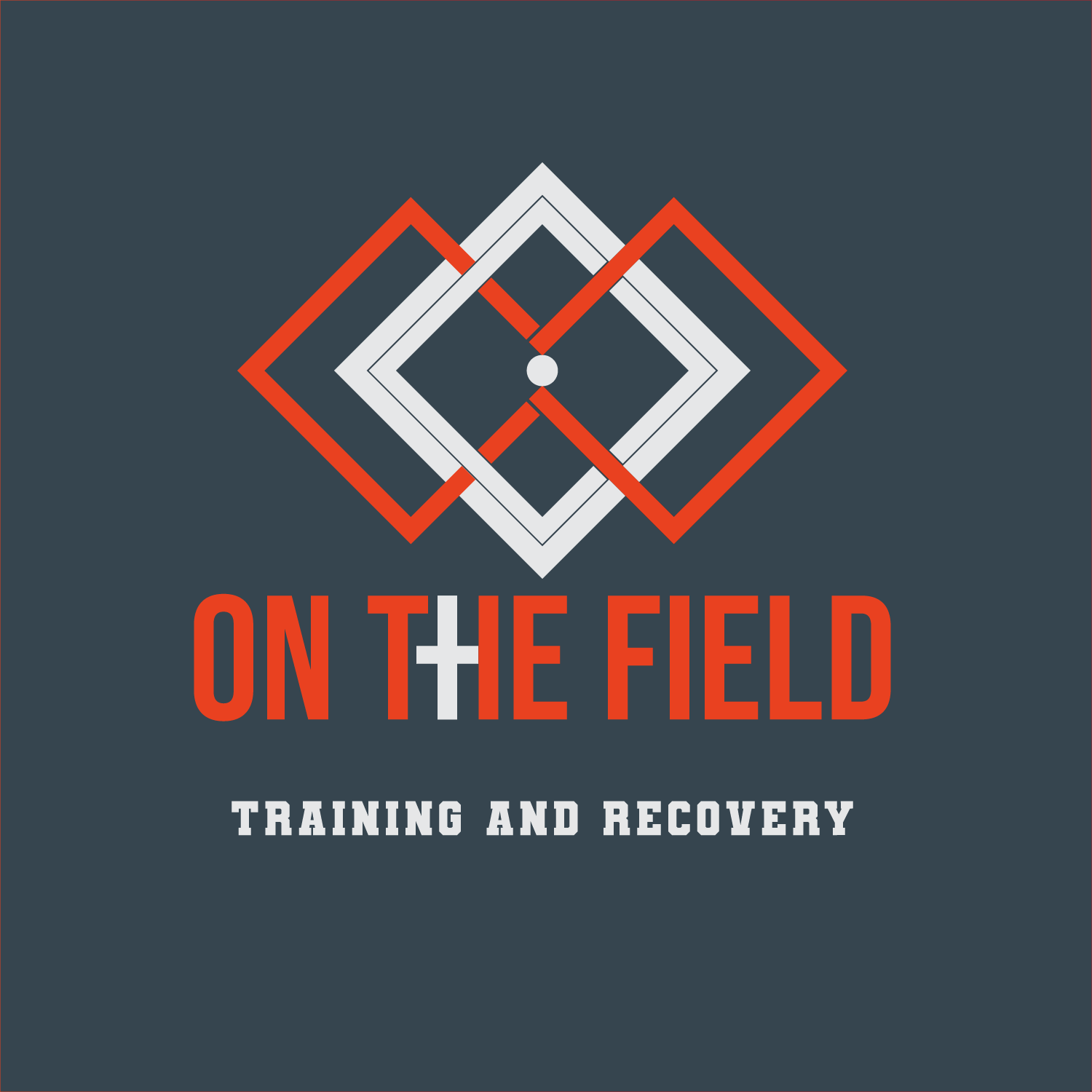
(On the field )charcoal, orange, white color scheme. Encompassing an infinity loop, a court, a cross and all through an artistic logo with alluring font styles compatible with the core concept. The cross integrated into the text adds a distinct medical/rehabilitation aspect, The circular shape inside the diamond suggests central focus or unity, The white diamond shapes forming a field reinforces the sports/training theme, while the orange diamonds make an appealing infinity figure to scream holistic support, timeless recovery for all sports.
LogoMaster
Designer
Mon, 06 Jan 2025 07:19:25 +0000
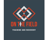
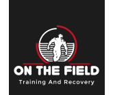
On the field black white red
LogoMaster
Designer
Mon, 06 Jan 2025 07:18:25 +0000
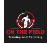
On the field color palette orange black white