
Designs by merapiproduction
For Contest: Business Logo Design
Design Entries
-
#28
-
#29
-
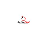
#30
-
#88
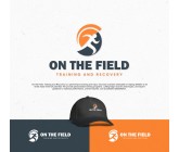
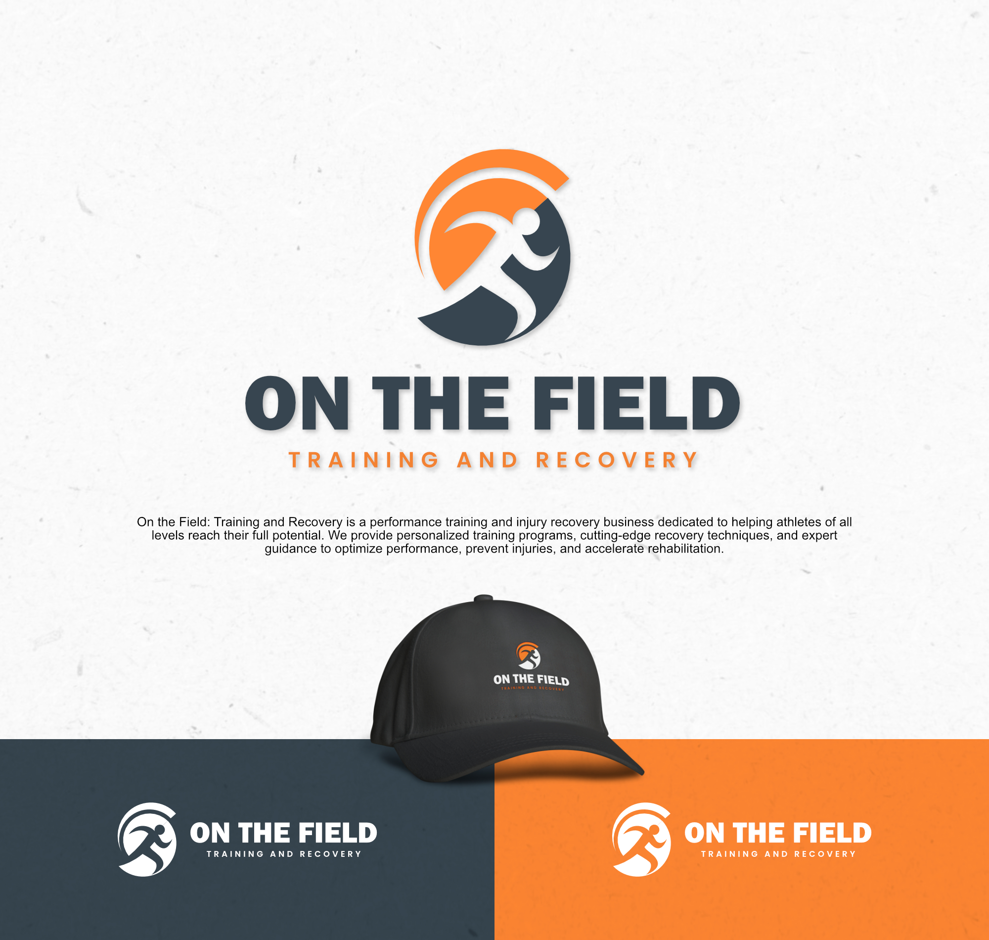
Athlete Icon in Motion:
The silhouette of an athlete in motion symbolizes passion, dedication, and strength. This forward movement represents continuous progress, reflecting On The Field’s vision to help clients reach their full potential.
Orange Circle and Arch:
The circle symbolizes the continuous cycle of training and recovery, while the color orange conveys energy, enthusiasm, and optimism. This inspires clients to keep going and never give up.
Charcoal Color:
The color charcoal gives a modern, professional, and elegant impression. Charcoal also symbolizes stability and trust, creating a sense of strength and solidity that represents the high quality of services offered by On The Field.
Strong Typography:
The bold font “ON THE FIELD” emphasizes strength and confidence, while the words “Training and Recovery” provide balance and focus on the main goal of providing training and recovery.
Color Combination:
The combination of orange and charcoal provides an eye-catching contrast. Orange represents the passion and energy of training, while charcoal reflects calm, professionalism, and a trustworthy approach to recovery.