Peca & Reza
2 Prizes → $110$75
Contest Designs
Design Brief
| Contest title: | Peca & Reza |
| Sub title: | El que peca y reza, empata |
| Category: | Logo Design |
Brand Name: |
Peca & Reza |
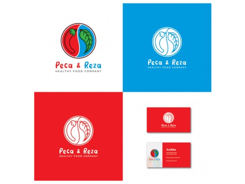
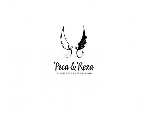
| Summary: | This is a healthy food company. We produce sauces, dressings and condiments for people on specialized diets such as paleo diet, keto diet, etc. The name comes from the Spanish saying "el que pesa y reza empata", which translates to English "he who sins and prays is o.k." // Ideally, we would like the logo to have an angel and a devil or something that represents half "holy/saintly/virtuous" and half "wrong/evil/diabolical/sinful". |
| Description: | This is a healthy food company. We produce sauces, dressings and condiments for people on specialized diets such as paleo diet, keto diet, etc. The name comes from the Spanish saying "el que pesa y reza empata", which translates to English "he who sins and prays is o.k." // Ideally, we would like the logo to have an angel and a devil or something that represents half "holy/saintly/virtuous" and half "wrong/evil/diabolical/sinful".
|
| Additional Information: | IMPORTANT - EXAMPLES: Find examples of logos that I like here: https://thelaunchpadtlp.box.com/s/kdn9s4zxsjzeuz5yzo2w3929jolt7gvi IMPORTANT - COLOR: I would like the logo to look good in black and white, but I would also like it to have a two-color version. Say red and blue or green and purple or what have you. IMPORTANT - TEXT AND COMPOSITION: I would like the logo to be in such a way that we can use the icon/illustration-part only or the text-part only, BUT (and here comes the tricky part)... But we would like the logo to be designed in such a way that when we use it in its full version (with both text and icon/illustration), the text and the illustration become a very tight composition. Sometimes logos look like the placing of the text doesn't integrate well with the rest of the design and we want to avoid this. IMPORTANT: We DO want something with an illustration featuring evil and holiness, sin and prayer, etc. |
| Design Goals: | Something elegant but quirky. |
| Design No-Gos: | Something tacky |
Contest Attachments
Contest material, sample files and attachments for the contest uploaded by Contest Holder.
| 811_387331564.zip | Logos that I like. | |
| 811_411478745.jpeg | Logos that I like. | |
| 811_1810029302.jpeg | Logos that I like. | |
| 811_2069038129.jpeg | Logos that I like. | |
| 811_614862035.jpeg | Logos that I like. | |
| 811_888071209.jpeg | Logos that I like. | |
| 811_1459062389.jpeg | Logos that I like. | |
| 811_1340529710.jpeg | Logos that I like. | |
| 811_571217316.jpeg | Logos that I like. | |
| 811_1529887465.jpeg | Logos that I like. |
About Contest
| Guaranteed $ Featured Blind | |
| Industry: | Food & Beverage |
| Created on: | Fri, 05 Apr 2019 19:46:40 +0000 |
| Ends on: | Wed, 10 Apr 2019 19:46:40 +0000 |
| Status: | Closed |
Prize(s)
| 1st Prize: | $110 |
| 2nd Prize: | $75 |



Comments
No comments yet!