
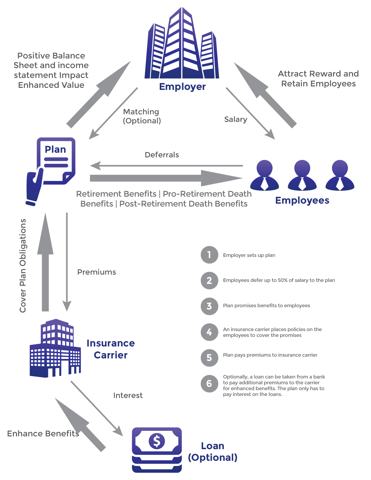
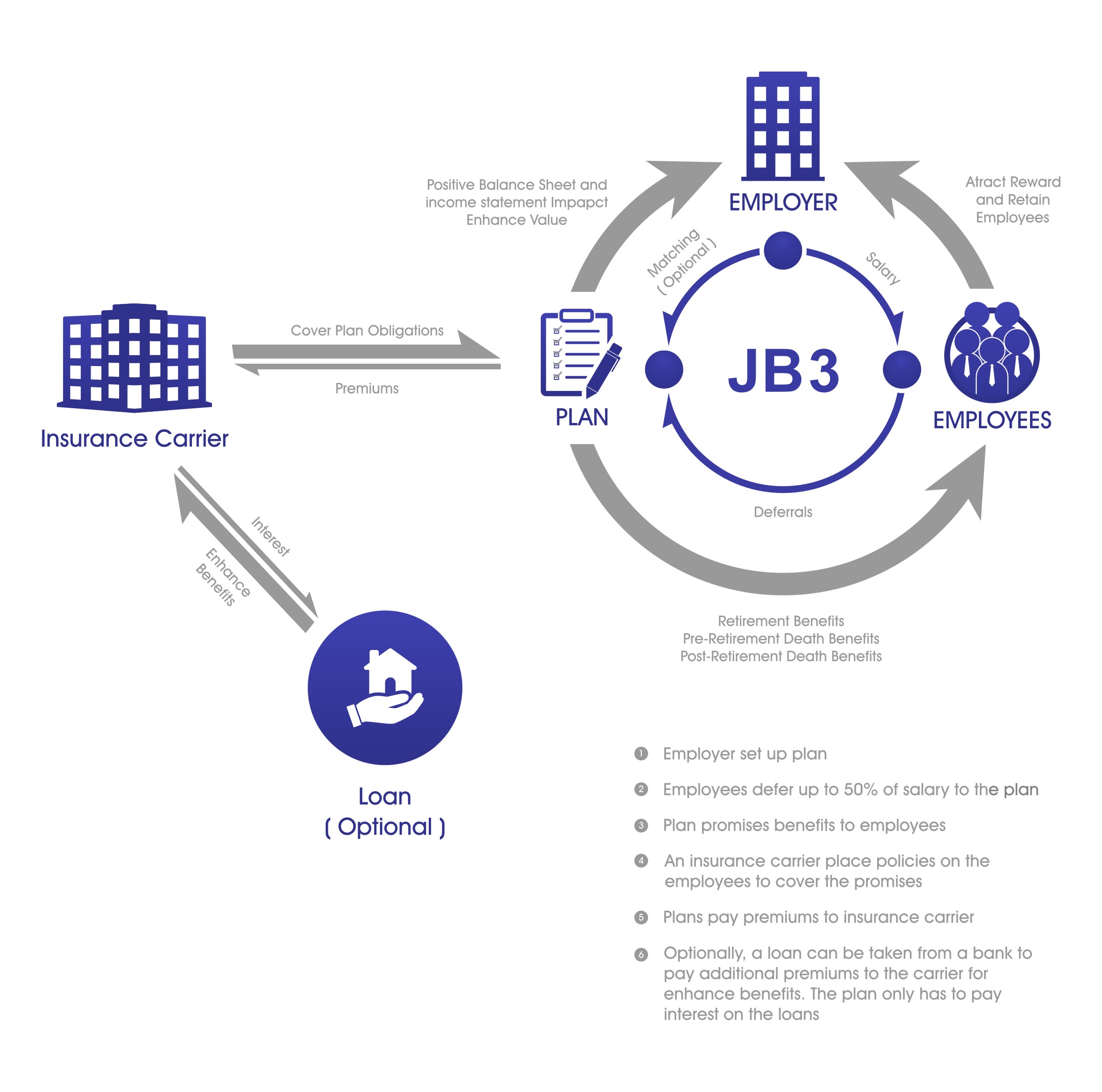
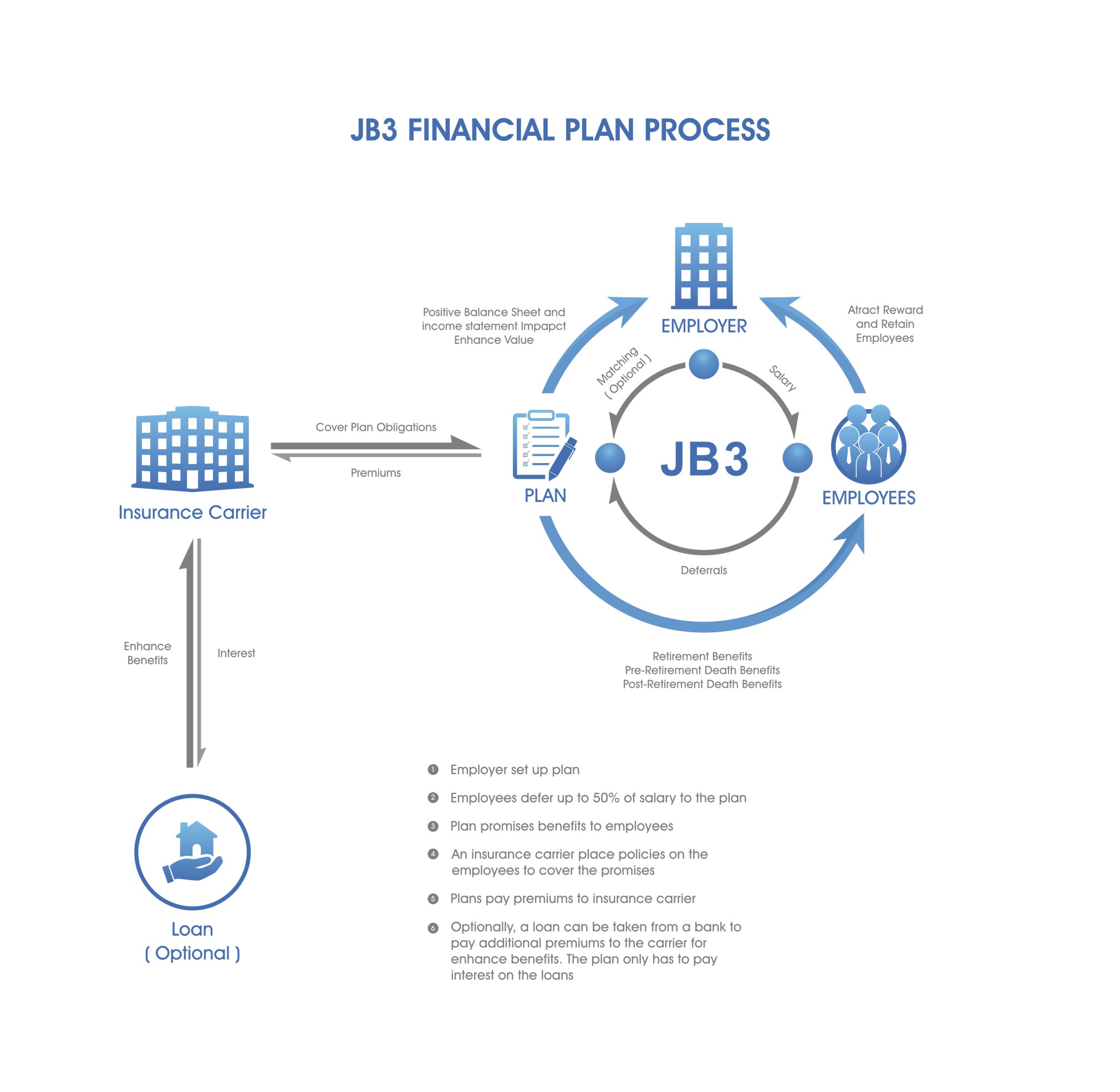
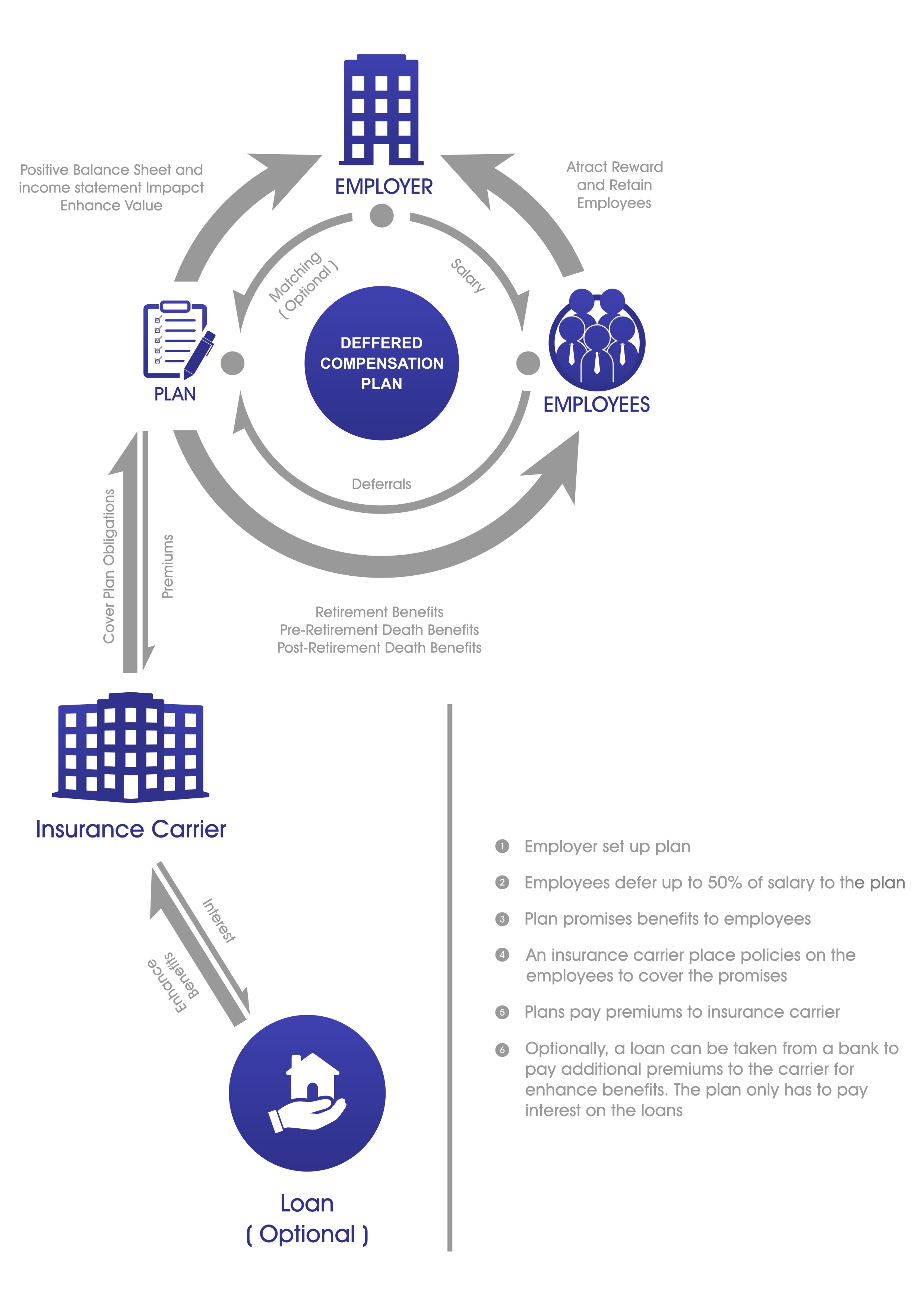
Financial Plan Process Infographic
— Retirement Plan process graphical explanation
Category → Graphic Design Contest
Industry →
Client → jjbgames
Stats → 25 entries • 4 designers
Prize → $110
Top 40 Designs


Design Brief
| Contest title: | Financial Plan Process Infographic |
| Sub title: | Retirement Plan process graphical explanation |
| Category: | Graphic Design |
Brand Name: |
JB3 |
| Summary: | I need an infographic to explain how a retirement plan we have designed works. We will be putting together PDF proposals for potential clients and one page will be this infographic that graphically depicts the interaction between the employer, employees and other interested parties. |
| Description: | We are financial planning company that puts together retirement plans for small businesses. We are looking for an infographic to depict the plan process. We have (very amateurishly) already put together a rough draft to simply show designers the process. We need talented artists to take what we have done and bring it to life with real graphics. |
| Additional Information: | The background should be white and the page layout should be 8.5x11 portrait. |
| Design Goals: | We use deep blues and greys in our logo and in our documents. We want a very professional looking illustration that is easy to understand. I am uploading a slide that we put together that explains the process. Arrows are used to depict something being given from one entity to another and the larger arrows are supposed to show a larger benefit going that way. We are trying to show that both the employer and employee get a large benefit. We have put the benefits in words next to the arrows. Do not be bound by this design. It is meant to be a reference to the designer about how the plan works. If you can illustrate it more clearly another way, please do. The process is written in detail on the uploaded slide. |
| Design No-Gos: | We do not want playful. We do not want bright loud colors. We are trying to put confidence into our prospects that we are professional and they are making a good choice. |
Contest Attachments
Contest material, sample files and attachments for the contest uploaded by Contest Holder.
| 513_1046772916.jpg | Design Document Information |
About Contest
| Guaranteed $ Featured | |
| Industry: | |
| Created on: | Mon, 21 Sep 2015 04:02:39 +0000 |
| Ends on: | Sat, 26 Sep 2015 04:02:39 +0000 |
| Status: | Winner(s) Selected |
Prize(s)
| 1st Prize: | $110 |
Comments