
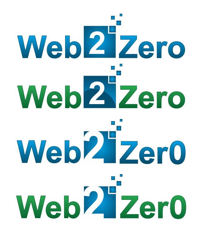
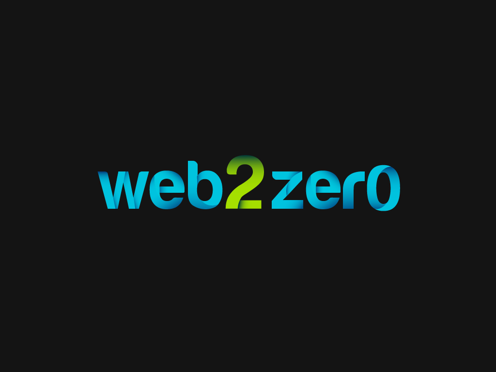
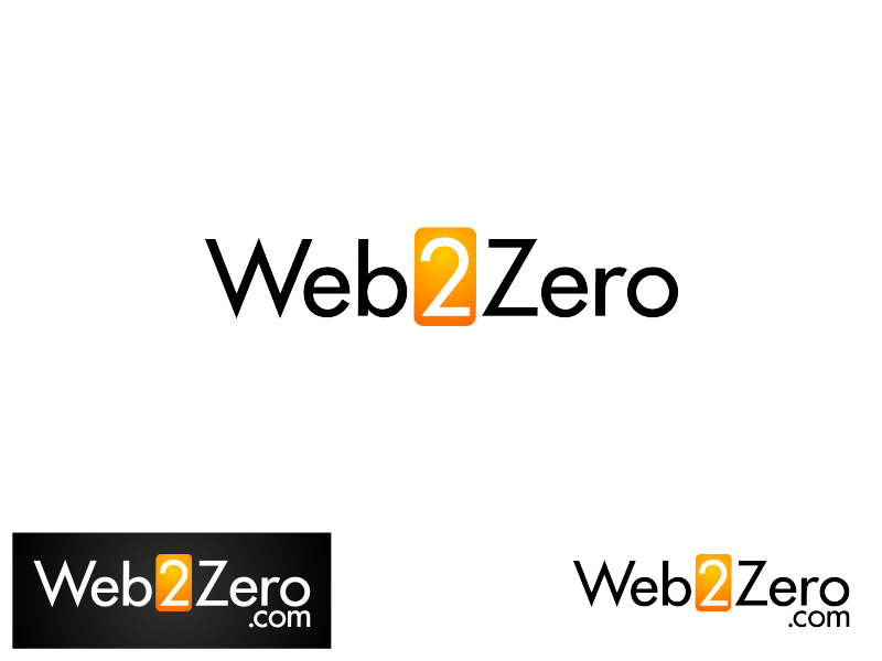
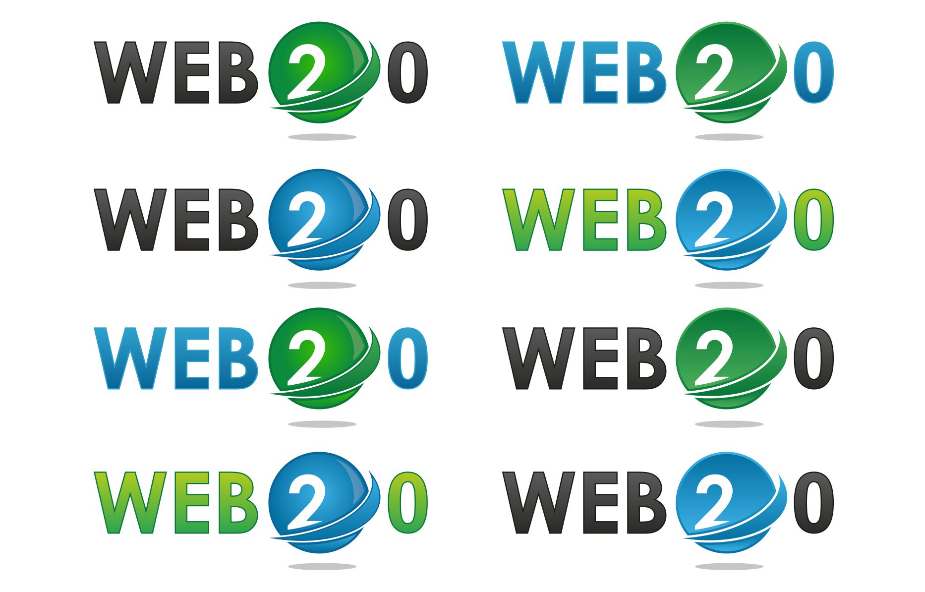
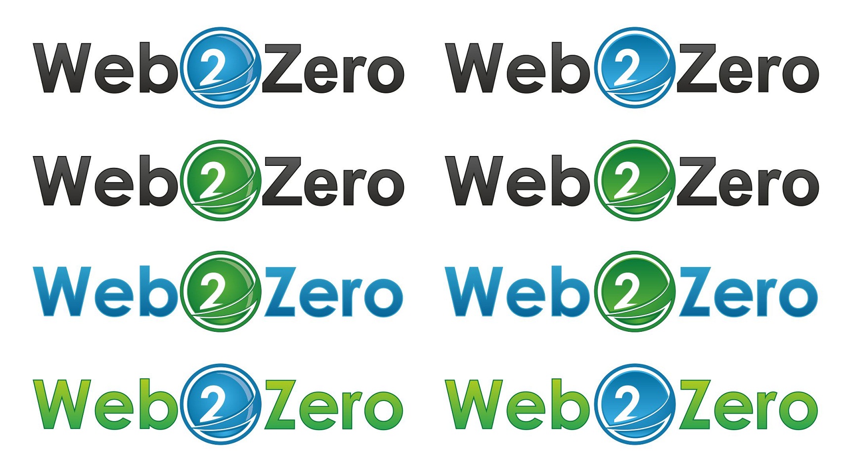
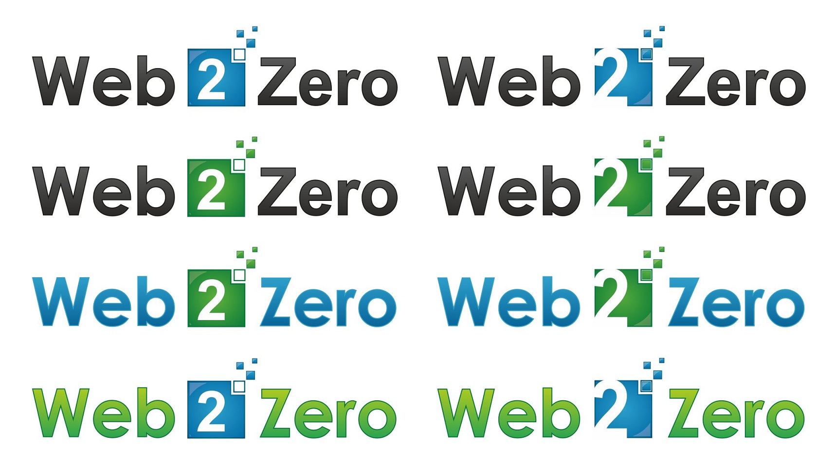
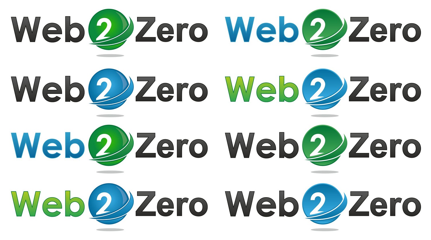
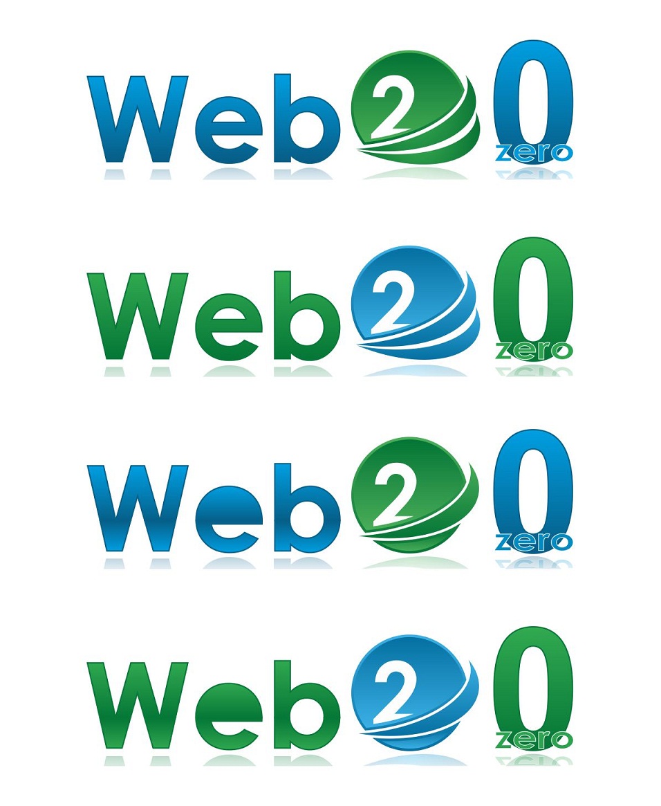
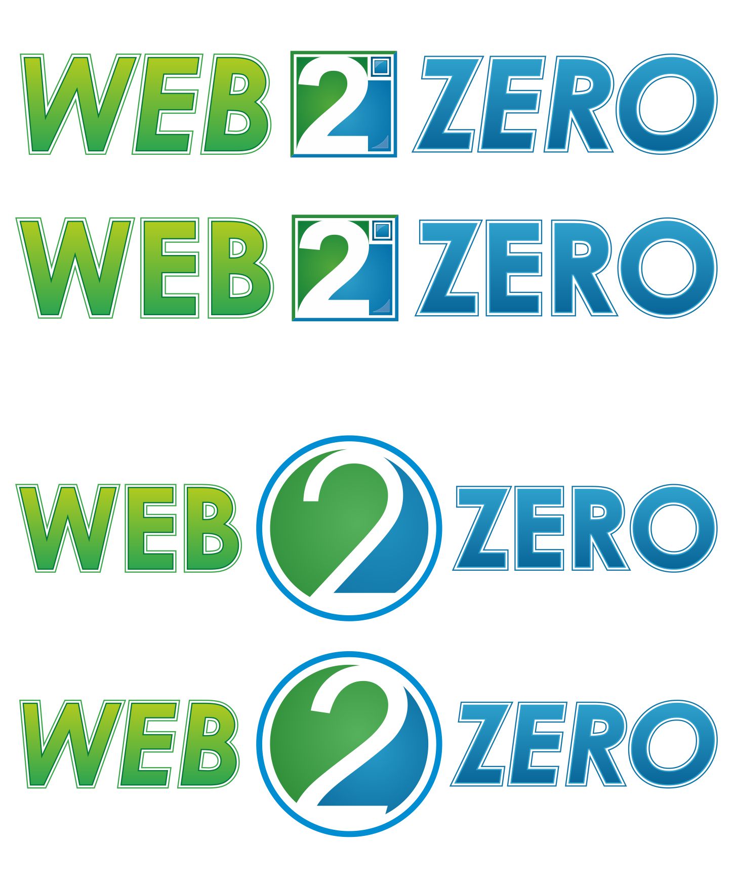
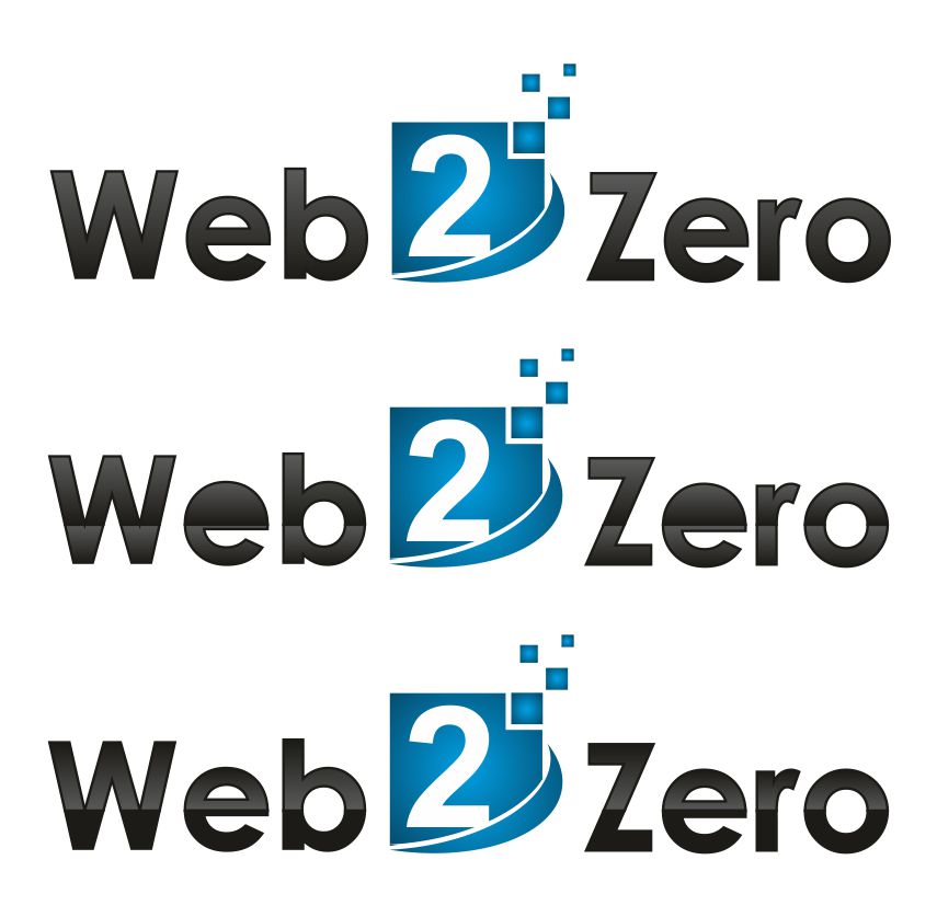
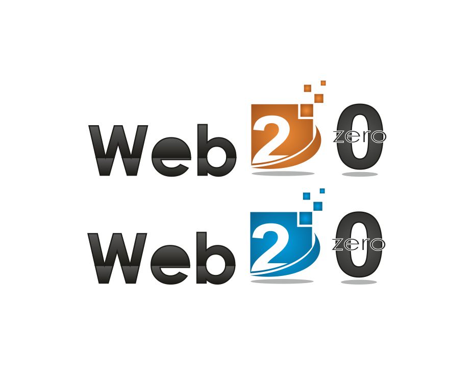
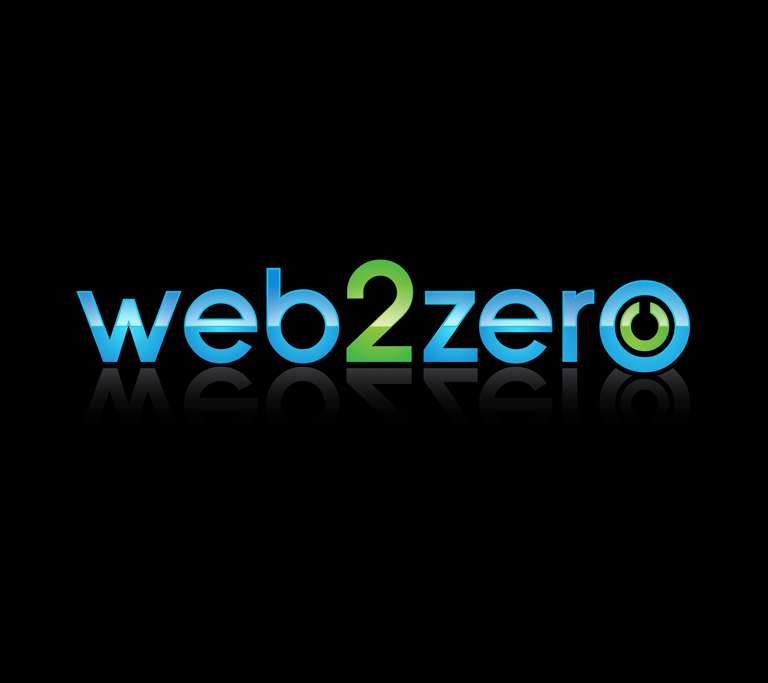
Web 2 Zero logo
— Web 2 Zero
Category → Logo Design Contest
Industry →
Client → web20
Stats → 115 entries • 38 designers
Prize → $89
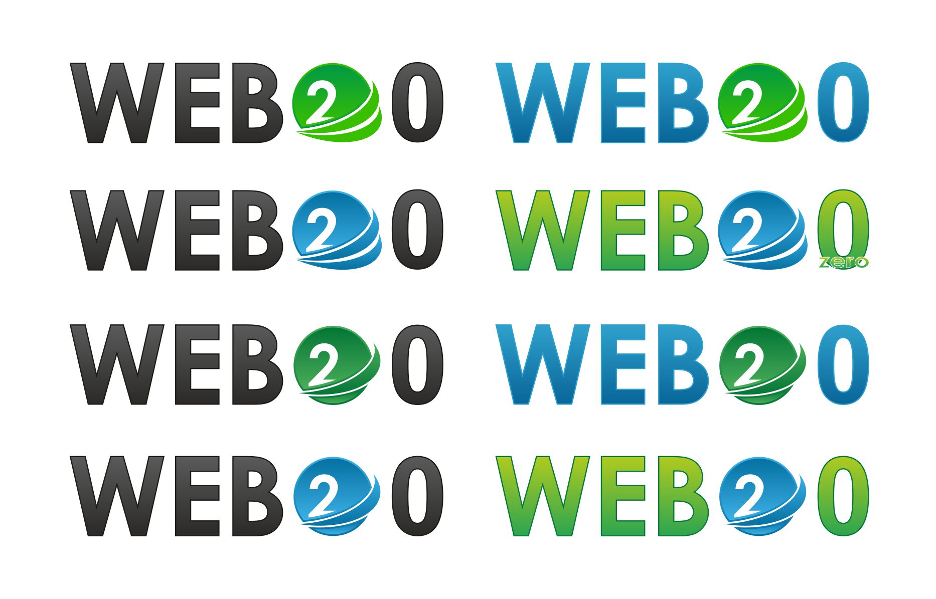
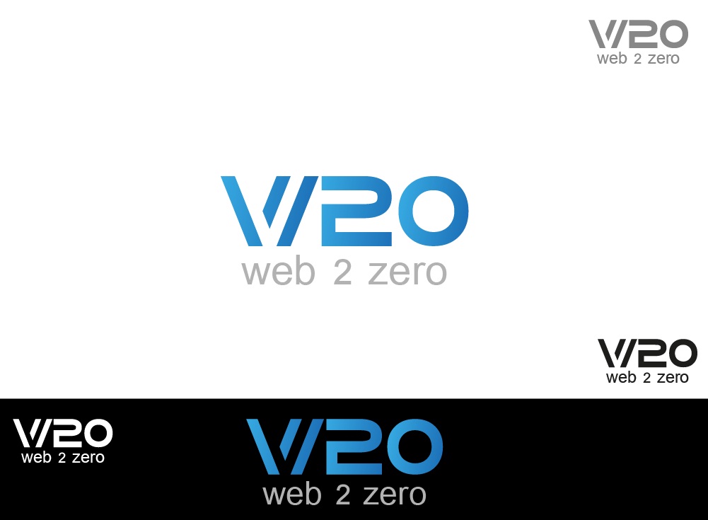
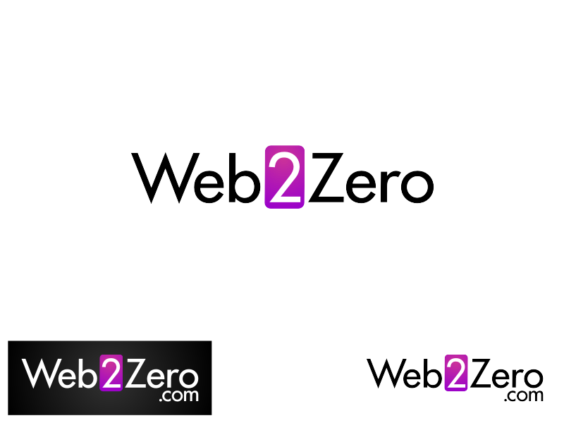
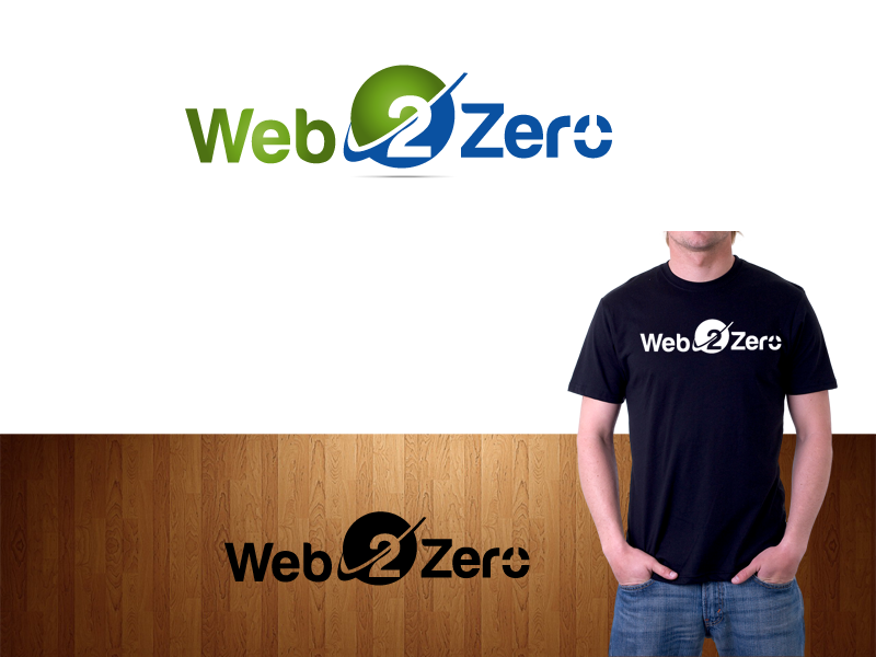
Top 40 Designs


Design Brief
| Contest title: | Web 2 Zero logo |
| Sub title: | Web 2 Zero |
| Category: | Logo Design |
Brand Name: |
Web 2 Zero |
| Summary: | We are a start up web development and hosting company. Mainly focusing on small businesses at first, but hope to soon move in to large clients eventually. Much of our expertise (there are just a few of us) lies in web software development and hosting. So although making a site or application is very easy, coming up with the idea for a logo has not been. |
| Description: | We are a start up web development and hosting company. Mainly focusing on small businesses at first, but hope to soon move in to large clients eventually. Much of our expertise (there are just a few of us) lies in web software development and hosting. So although making a site or application is very easy, coming up with the idea for a logo has not been. Both the symbols alone, as well as with text underneath. We also tried the o in zero as a 0. A true professional can probably make these work. I could not and will be sticking to software design! If you use a 0 with a slash in it, it seems to fit better. We defiantly like this idea of using a 0 in the logo if it can be pulled up. It is not, however, required. The site itself is called Web 2 Zero Design, but the hosting part will be Web 2 Zero Hosting, so a logo with simply Web 2 Zero would be best, unless you include both "design" and "hosting" if you put text in your submission. I will be checking in very regularly, so please feel free to comment with further questions. I will give feedback as well throughout. |
| Additional Information: | We have found so many great ideas here, but we would like to see some more. So we are extending the contest for 6 more days. Colors we want to use are the ones used in #12, or somewhat closer so it may work well with white background also. I like #49 for its simplicity. Thanks and wish you all the best. We are again extending the contest with the prize money increased from $89 to $125. We have chosen some of the ideas and want designers to amend these to meet our requirements. Thanks to all designers for really creative and hard work. |
| Design Goals: | (in html hex)The site is in gray scale, and going to have a blueish color for accents:2ea0cb I also would not mind a green, maybe a bit less bright than this:37bf00 The two look very "childish" together in my 5 minute attempts at creating something, but I'm interested in seeing designs using one, the other, or both really. I would also not hate the idea of a multitude of colors, though with the fairly gray-scale site, it can't be to bright. This logo MUST work on a darker background. |
| Design No-Gos: | not sure |
Contest Attachments
Contest material, sample files and attachments for the contest uploaded by Contest Holder.
No attachments yet!
About Contest
| Guaranteed $ | |
| Industry: | |
| Created on: | Wed, 23 Nov 2011 10:47:15 +0000 |
| Ends on: | Mon, 12 Dec 2011 10:47:15 +0000 |
| Status: | Winner(s) Selected |
Prize(s)
| 1st Prize: | $89 |
Comments
Showing last 10 comments - View All
Admin
110designs.com
Its really very hard for me to choose winner as there are so many great ideas presented here.
Thanks.
Thanks.