
Poker Room and Poker Chip Logo
— Custom Logo
Category → Logo Design Contest
Industry →
Client → MattW
Stats → 26 entries • 4 designers
2 Prizes → $130$50
Start a Contest Like This!


Top Designs


Design Brief
| Contest title: | Poker Room and Poker Chip Logo |
| Sub title: | Custom Logo |
| Category: | Logo Design |
Brand Name: |
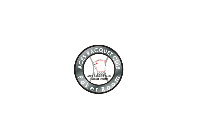
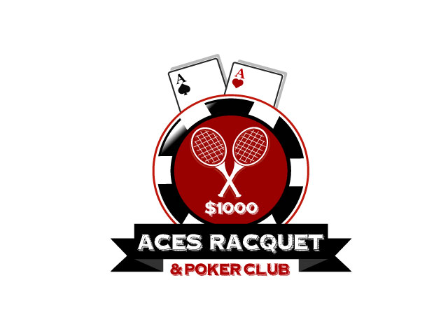
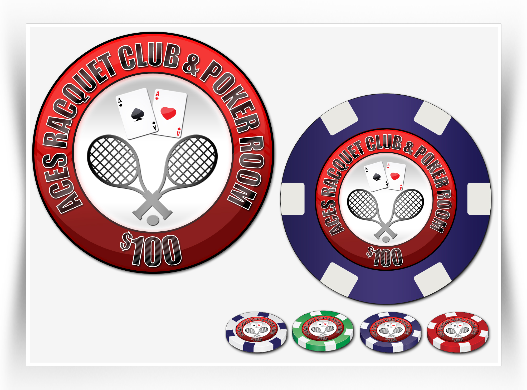
Aces Racquet Club & Poker Room |
| Summary: | Having a set of custom chips made for my weekly poker games and want help designing the logo. |
| Description: | I'm a tennis player / coach and an avid poker player, hence the theme "Aces" I love Wimbledon(classic) and the US Open(modern). I like both a classic/vintage look and a more sleek modern look so you can do either one or both. I haven't decided the direction it's going yet, I'm counting on your expertise to win me over. If you do one of each you up the odds of being chosen. |
| Additional Information: | A rectangular design is eligible for 2nd place as I will be having plaque chips made eventually |
| CH Wants: | I'm looking for a logo that incorporates Ace playing card(s) with tennis Racquet(s) and/or a tennis ball. The logo will also be going on chips so it needs to be round in shape I would like one of the Aces to be the ace of spades and the other to be either hearts or diamonds (no preference) Color preferences: Black and Red (but not a requirement, fine if only backgrounds or accents) Stay away from Purple or Orange (definitely) I will need room to add a denomination to the chips (i.e. $1000) Can lay across part of the logo but not the name of course I like the use of the & instead of the word "and" |
| CH Don't Wants: | I don't want it to look cheesy, cartoony, or like clip art. |
Contest Attachments
Contest material, sample files and attachments for the contest uploaded by Contest Holder.
No attachments yet!
About Contest
| Featured | |
| Industry: | |
| Created on: | Thu, 16 Jan 2014 21:23:07 +0000 |
| Ends on: | Thu, 23 Jan 2014 21:23:07 +0000 |
| Status: | Winner(s) Selected |
Prize(s)
| 1st Prize: | $130 |
| 2nd Prize: | $50 |
Comments
#21 Can you turn the ball to look like the one in #12
#7 Can you put the spade in the racquet like in #8 and #16
#6 I love spade and the ball. Can you make the spade a little smaller so it doesn't totally overshadow the ball? Can we use a color on the edge that is less orange
#2 There seems to be a little too much glare across the letters and image. I do like the color on the bottom of the outer circle.