
Website Logo
— Community for routine household maintenance
Category → Logo Design Contest
Industry →
Client → d.cares
Stats → 23 entries • 7 designers
Prize → $145
Top 40 Designs


Design Brief
| Contest title: | Website Logo |
| Sub title: | Community for routine household maintenance |
| Category: | Logo Design |
Brand Name: |
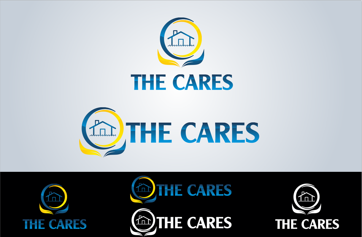
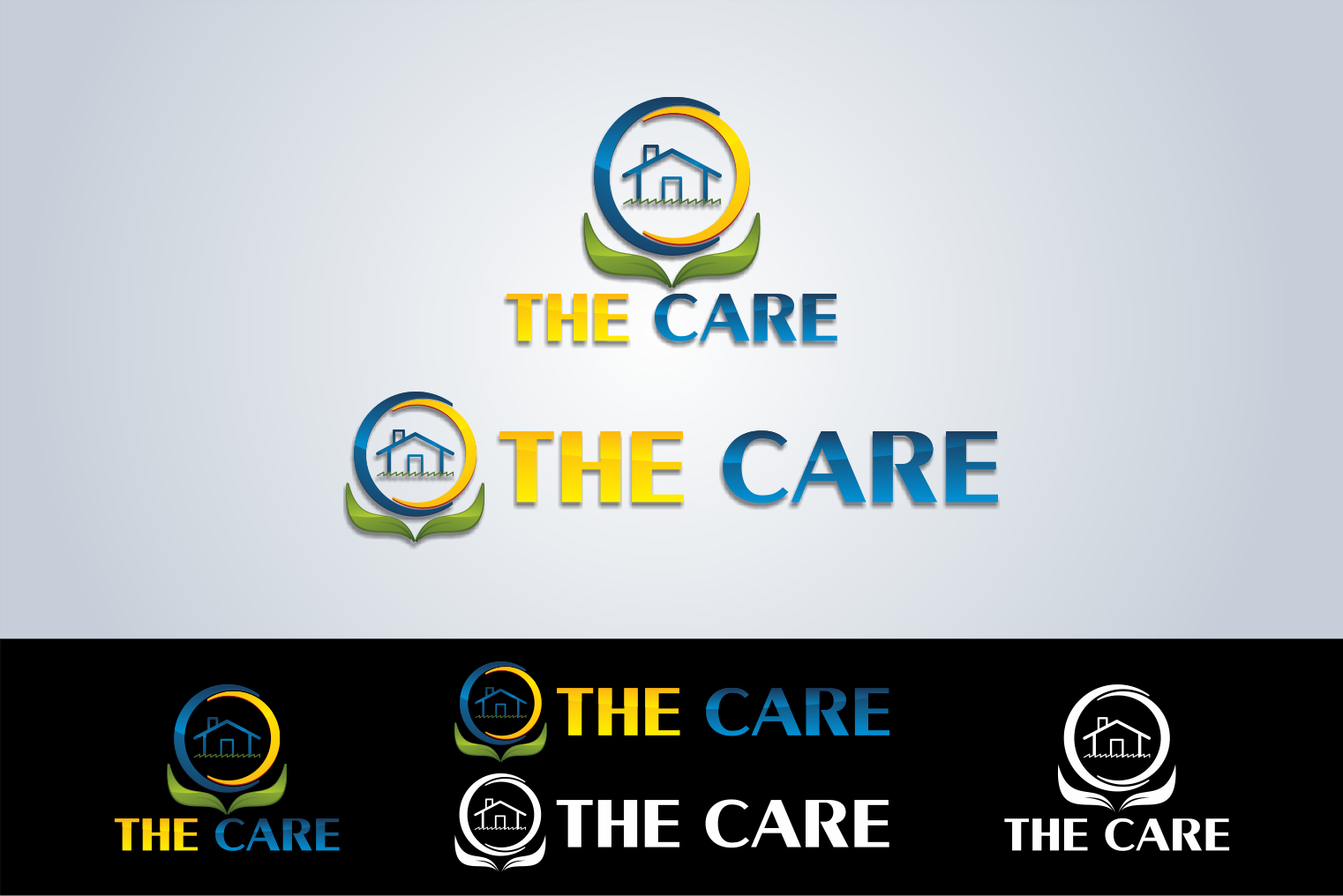
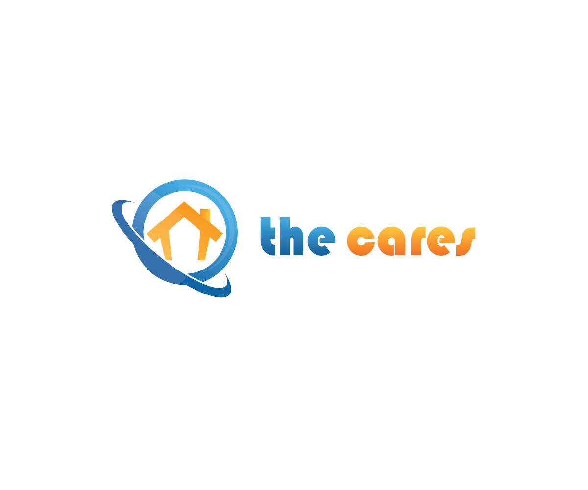
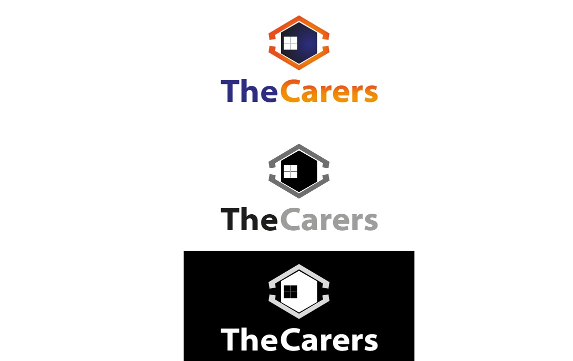
TheCares |
| Summary: | This logo will be for a new website/community that is for information around routine household maintenance (ie. lawn care, home HVAC maintenance, etc). |
| Description: | This logo will be for a new website/community that is for information around routine household maintenance (ie. lawn care, home HVAC maintenance, etc). |
| Design Goals: | No specific requirements. I like a lot of blue/yellow and blue/orange color combinations but please do let that limit your designs. I tend to like squarish dimensions but please dont let that limit you either. I am very open to abstract logos. I will try to leave plenty of feedback to help guide the process. |
| Design No-Gos: | Not specified |
Contest Attachments
Contest material, sample files and attachments for the contest uploaded by Contest Holder.
No attachments yet!
About Contest
| Industry: | |
| Created on: | Thu, 17 Nov 2011 10:15:28 +0000 |
| Ends on: | Thu, 24 Nov 2011 10:15:28 +0000 |
| Status: | Winner(s) Selected |
Prize(s)
| 1st Prize: | $145 |
Comments
Other designers, there are more contests from 'thecares' will be coming. so better luck next time.
thanks.
Like the font in #10. #9 is better now but it still missing some dynamics.
#11 is also good. but the symbol is somehow dedicated to real estate industry. can you do it with some abstract form?
thanks
#8 need some tweaking in the symbol as well as incorporate blue color in it. looking for some abstractness and dynamic symbol that also show website community.
thanks and looking forward for more entries.
#1 can you provide an option with blue color incorporated. also can change the symbol a little bit and change the font and layout as well so it may look professional. right now its not looking a professional one.
#6 too many colors. its not looking good. can you provide us with 2 color combinations?