Excellent HTML layout and design needed for a single page
— no javascript/coding reqd
Category → Website & App Contest
Industry →
Client → csmedley
Stats → 14 entries • 4 designers
Prize → $212
Top 40 Designs
Design Brief
| Contest title: | Excellent HTML layout and design needed for a single page |
| Sub title: | no javascript/coding reqd |
| Category: | Website & App |
Brand Name: |
AstroSummaries |
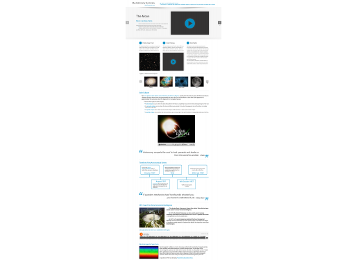
| Summary: | Check here for latest brief. Our Need We need you to take our existing web page that summarises some basic educational information and make it pretty! The web page is a summary document created by a hypothetical individual who wishes to use it to revise some basic Astronomy concepts. We want you to show us how to layout and markup the various types of content (quotes, videos, images, etc.) in a way that is very beautiful. |
| Description: | The summary document:
|
| Additional Information: | Here is the existing web page data we need made beautiful: http://nomoredata.com/example/ Here is a link to the design brief in a single document: https://docs.google.com/document/d/11jha6bi8WvHnu8q3A_LNPLbGPgjUoBBNXRjrQbYfgpo/edit?usp=sharing |
| Design Goals: | Target audience Someone who:
Values, feelings and messages we want the design to communicate
Goals we want the design to achieve
Colors we do and don’t like
Specific ideas and imagery we like, as a general direction or theme
Examples of other designs we do and don’t like
|
| Design No-Gos: | What We Don't Want We don't want a full web site. This is one beautiful page with excellently laid out content and extra images and other media as appropriate in order to make it beautiful, functional and interesting. |
Contest Attachments
Contest material, sample files and attachments for the contest uploaded by Contest Holder.
No attachments yet!
About Contest
| Industry: | |
| Created on: | Wed, 24 Jul 2013 08:37:34 +0000 |
| Ends on: | Wed, 31 Jul 2013 08:37:34 +0000 |
| Status: | Winner(s) Selected |
Prize(s)
| 1st Prize: | $212 |



Comments
Showing last 10 comments - View All
The contest took so much time and we were waiting for your response daily but now when i open the contest is closed and i can't do the changes
thanks
Rooni
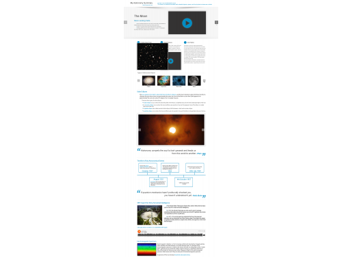
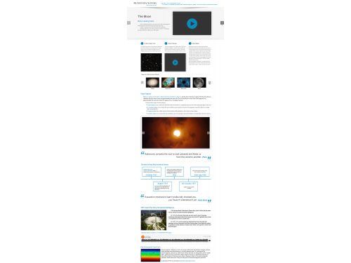
SETI section is better, clearer.
Other notes as per previous reviews.
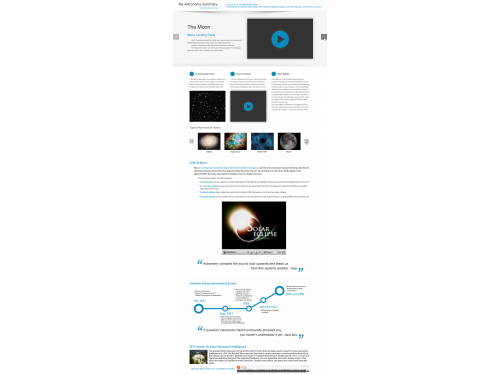
Timeline is better, is it HTML?
Is it possible to popup a larger image of, say, the hubble deep field when the user mouseovers on the thumbnail?
Is there a way to decorate the slide show?
Still good as per previous reviews.
see review for #5
Definition needs to be a part of the document (there may be many definitions).
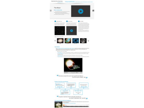
Timeline is beautiful, but needs to be HTML, not a single image.
Could the author of the quote be marked up differently to the quote?
Still like the columns, and the effective use of whitespace.
Good use of space.
Great custom bullet points.
Nice featured section (Moon Landing Facts).
Nice clean fonts.
Doesn't demonstrate enough different elements to be considered: timeline, quotes, image group etc.
Bottom looks like a web site - this is an HTML doc.
Excellent use of whitespace.
Definition needs to a separate part of the page.
Custom bullets are great but need to be general enough to be useable for different topics (i.e. not moon)
Beautiful use of columns!
"Read More" will need to be AJAX to expand (So it doesn't require two HTML pages)
Timeline is getting there.
Quotes should stand alone as there may end up being a dozen or so sprinkled throughout the doc.