
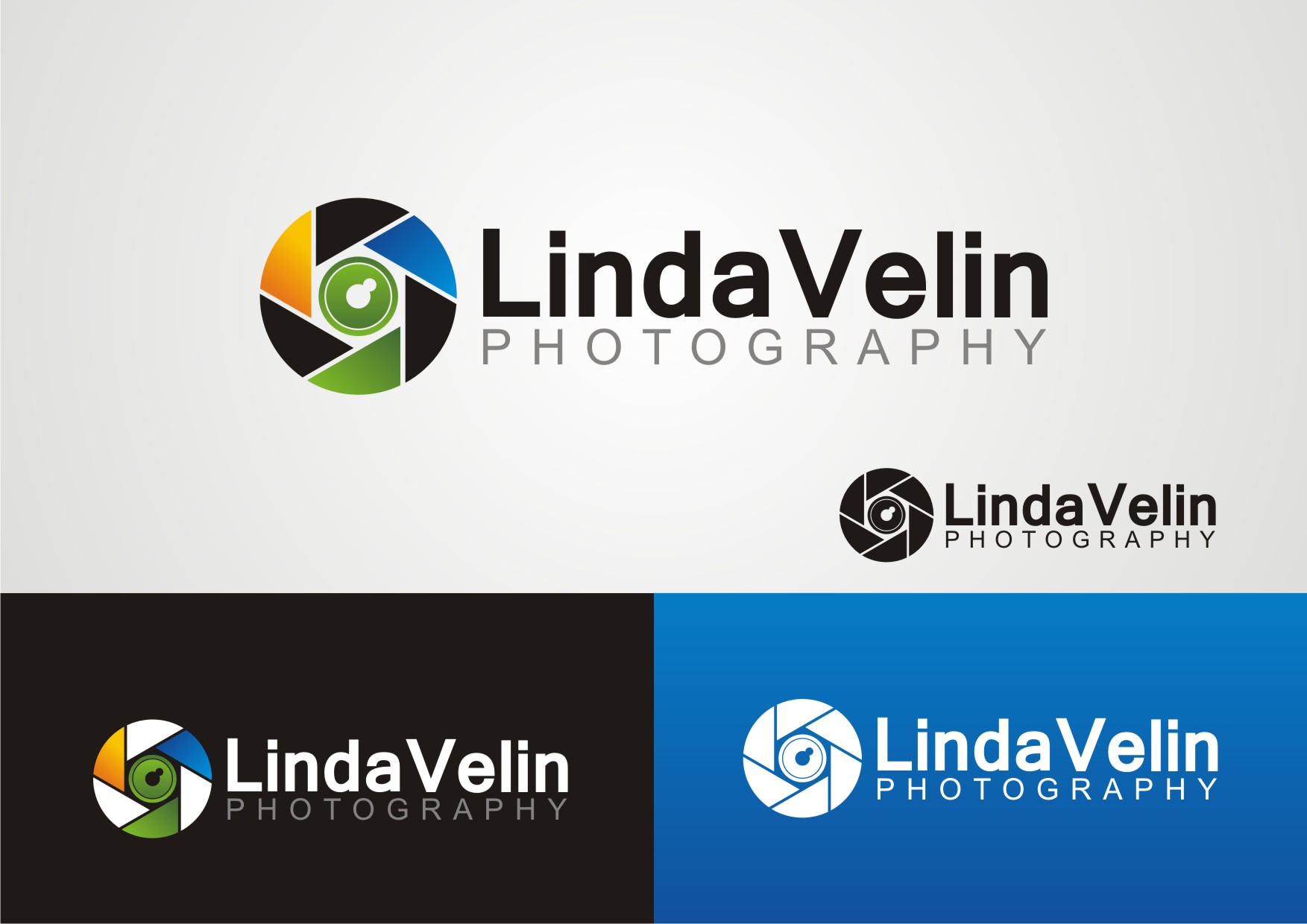
Photography Logo
— Not available
Category → Logo Design Contest
Industry →
Client → lvelinphoto
Stats → 67 entries • 6 designers
Prize → $90
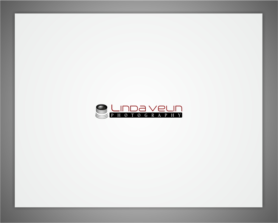
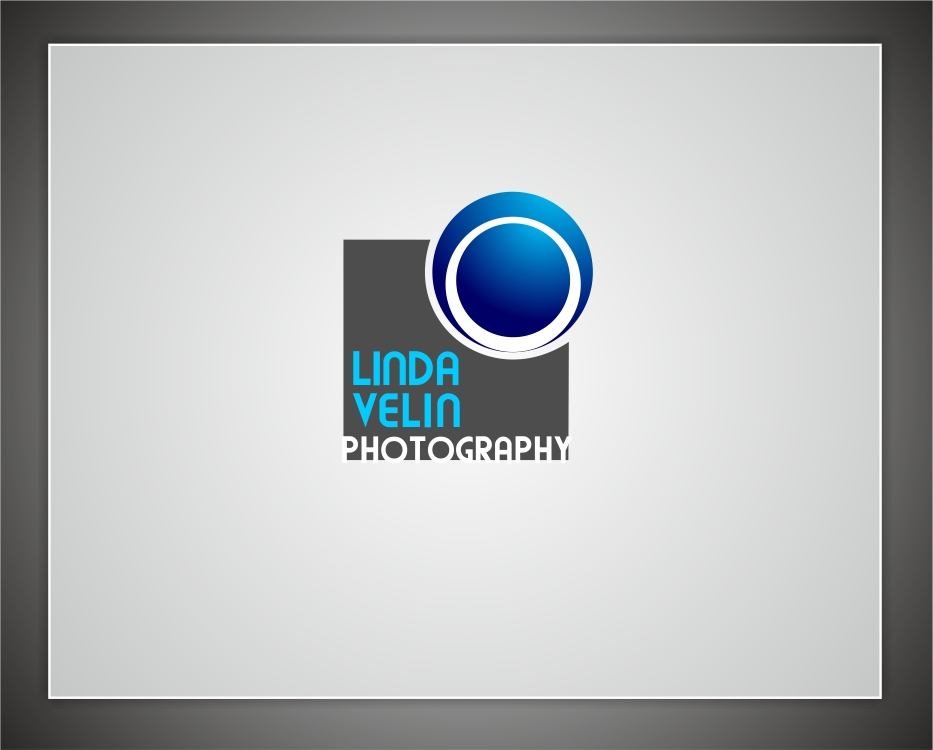
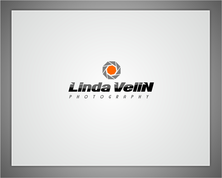
Top 40 Designs


Design Brief
| Contest title: | Photography Logo |
| Sub title: | Not available |
| Category: | Logo Design |
Brand Name: |
Linda Velin Photography |
| Summary: | Photography business - weddings are my primary income but I also do portraits, events, decor, food, travel, documentary, etc. So I don't want something too "wedding" and feminine. I'd like something that would speak to commercial clients as well. |
| Description: | Photography business - weddings are my primary income but I also do portraits, events, decor, food, travel, documentary, etc. So I don't want something too "wedding" and feminine. I'd like something that would speak to commercial clients as well. |
| Design Goals: | Logo should be
I want my logo to express to my clients that I'm creative, fresh and unique. NO PINK or LAVENDER please! Other than that I'm open to ideas. |
| Design No-Gos: | NO PINK or LAVENDER please! |
Contest Attachments
Contest material, sample files and attachments for the contest uploaded by Contest Holder.
No attachments yet!
About Contest
| Featured | |
| Industry: | |
| Created on: | Sun, 30 Oct 2011 00:24:06 +0000 |
| Ends on: | Sun, 06 Nov 2011 00:24:06 +0000 |
| Status: | Winner(s) Selected |
Prize(s)
| 1st Prize: | $90 |
Comments
Showing last 10 comments - View All
Thanks to all creative designers.
Thanks to all designers, specially to these top three designers. You work really very hard.
bandhuji #44 : can you please small the 'N' in the Velin, dont want it to be in caps. Also the photography text is large, can you please make it small size.
I love the fonts used in #39.
drope #43 : you still did not changed the font to be something softer. The font is too bold. Can you please do it as the time is too short and I want to extract 2 or 3 designs for the final round, from which I can select the winner.
Admin
110designs.com
These are too bold looking.
thanks.
drope: I like the fonts in #21 and #25. Logo symbol needs some tweaking in #21. Like the symbol in #22, but the font is too strong. Can you please soften the font & colors.
Don't like the #23, #24 and #25 as they seems to be stock cliparts.
Thanks for all your hardwork designers. 3 days to go, lets see who will be the King.
I am also an amateur photographer. That's why I'm loving it.
#3 I love the use of colors in the symbol. But the isnt seems to be suitable. Like the font of the #1 and #7.
#11 layout of how to integrate symbol in text is good.
Like the #13 as well.
Thanks.
Thank you.