
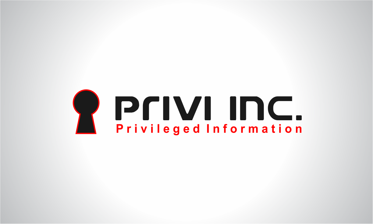
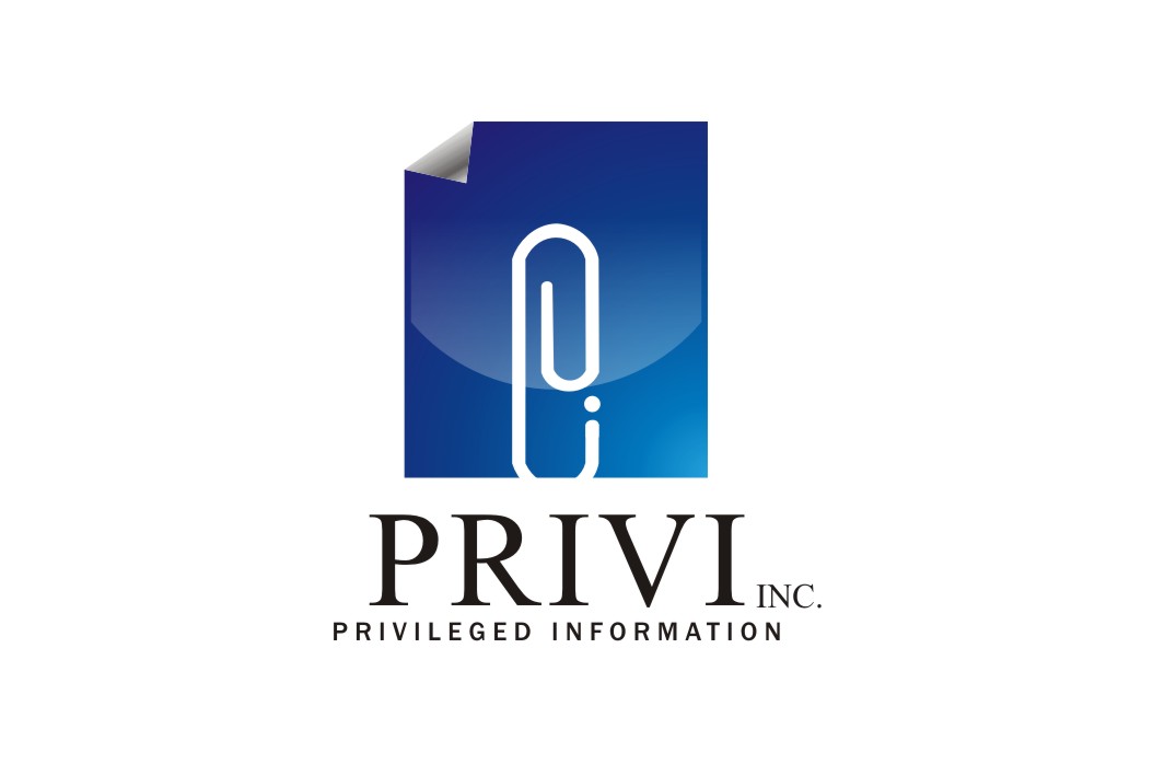
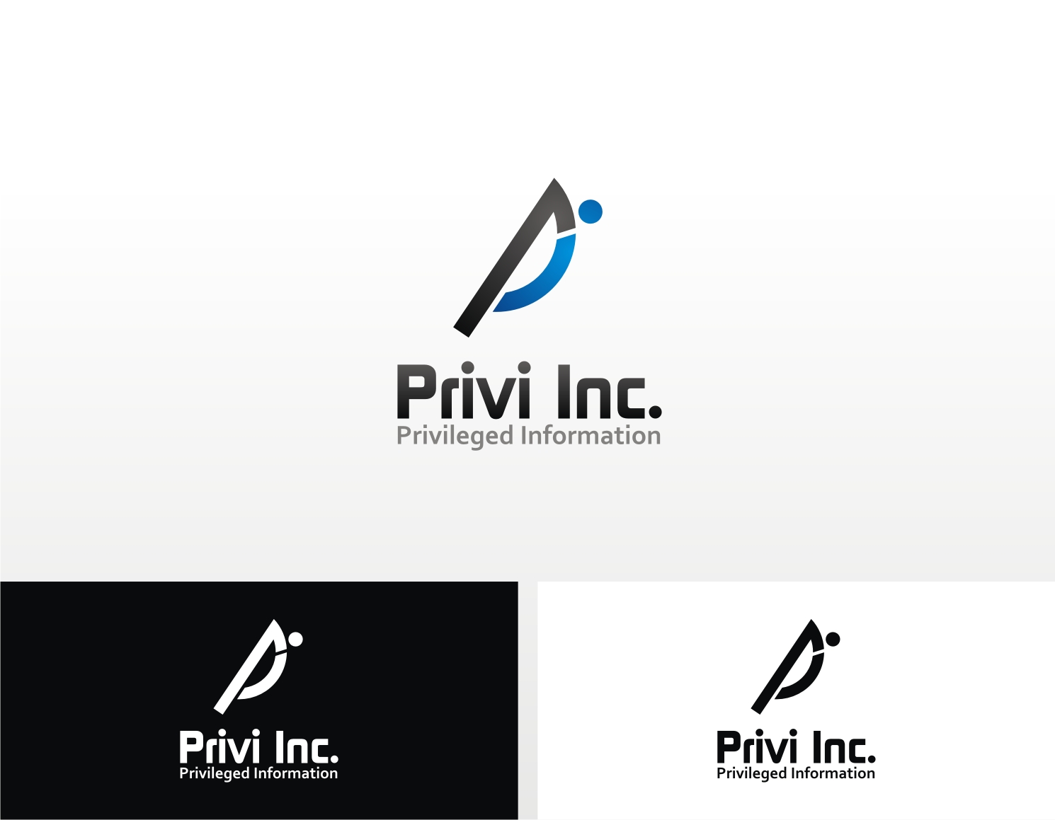
Privi Inc. Logo Design
— privileged information
Category → Logo Design Contest
Industry →
Client → Dan
Stats → 83 entries • 27 designers
Prize → $125
Top 40 Designs


Design Brief
| Contest title: | Privi Inc. Logo Design |
| Sub title: | privileged information |
| Category: | Logo Design |
Brand Name: |
Privi Inc. |
| Summary: | We are looking for create a logo design for our new site dedicated to providing intelligence reports for people who are interested in what people think about them; people who need to preserve a public identity; these reports will analyze what regular people say about them on the Internet or in the social media sphere. |
| Description: | The privi name is read like 'privy', a throw-back to privilege, privileged information. The logo could have a caption under it, with a tag such as 'privileged information', though we are open to explore creative options with or without a tagline. The feel we want for the logo is one that should emanate objectivity and brand trustworthiness, as well as professionalism in dealing with people's personal information (almost like a cyber security firm, only for people's personal information online). Preference will be given to clean, open designs with instant, simple brand recognition. We are looking for something masterfully crafted. Target Market: educated audience; public persons such as politicians, people in the public spotlight, aged 40-50+, wealthy. |
| Design Goals: | Other visual tags: professional, masculine, conservative, upmarket, traditional, serious, elegant |
| Design No-Gos: | We are open to seeing what your creative capacity throws at us! Bring it! |
Contest Attachments
Contest material, sample files and attachments for the contest uploaded by Contest Holder.
No attachments yet!
About Contest
| Guaranteed $ | |
| Industry: | |
| Created on: | Tue, 29 May 2012 17:40:05 +0000 |
| Ends on: | Wed, 06 Jun 2012 17:40:05 +0000 |
| Status: | Winner(s) Selected |
Prize(s)
| 1st Prize: | $125 |
Comments
I understand that a lot of work goes into each design, and I want to thank you for taking the time to do this. If you have any questions, please let me know. I look forward to more designs, and finding the one that truly represents our company's identity!
Cheers,
Dan
#46-48 - Ibram, I think #47 has potential and it's pretty clean-cut. However, I want it to express the idea of digital order, stability, categorization; right now, it makes me think of a office supplies company. If you can play with it more, go for it.
#49, Art_ant, I do like your colors, not sure about the logo part. What were you trying to represent?
#50, Mutmut, interesting idea, I do like the variation on the door lock representation; maybe a smaller logo (I like the rubix cube feel), but please work on your font, it's very cheap feeling. Give it another go, please!
#51-52, Iris, too pale and shows very little vigour; need it to be bolder, and more modern looking.
#28, 29 - I appreciate your attempt, though I think the execution is lacking.
#32 - Duckart, I'm not sure what you were going for with this one, but I'd be happy if you gave it another go.
#33 - Ninja, I do like the feel of your design, it blends modern and conservative, I can trust it, but it's not memorable at all. Could you give it some personality? Do try it, I think you're on the right track aesthetically.
#34, I do like your bold and clean color scheme, though I'm not enthusiastic about the rest. You have a good eye for symmetry though.
#35, 36 - Gobid78, I do like #36, it seems its got what it takes, maybe the colors are off, and again, it needs a little bit of personality. You're definitely on the right track with that one, please give it another few tries.
#37-40 - Thanks for your submissions, Cromox; the designs look too dated and very mechanic, unfortunately.
#42 - Wisto, I do really like your color scheme, and you are definitely talented; Unfortunately, I ran into the same issue with it looking too much like an information kiosk or a parking sign. If you could work on that issue, I'd be happy to see another few of your submissions. Thanks!
#14-17 - Droplet, I'm sorry, I'm really not feeling the color scheme, nor the little people figurines; it's very generic looking and doesn't really communicate the abstractness of what the business is ultimately about.
#18 - I do really like this design, except that the dialogue bubble is too overdone, and doesn't really communicate seriousness and information management or a serious consulting firm. But please do try again with the idea, I did like the lines of text and the overall feel of your design.
#19 - Echo, too much like a snowflake, and the colors are too faded.
#20, 22 - Truth, I like the 'i' idea, though not a fan of the 'P' - also, if you can come up with a way so that the sign doesn't look like an information booth/desk or like a park here sign, props to you.
#21, 23 - Ibram, too generic, and again too faded; your #23 would work well with a sailing design, it reminds me of sports somehow.
#24 - Nikita, you obviously have design skills, and your design actually has the spark that most of the others are lacking. However, the logo part looks too much like a parking sign.
Thank you for submitting designs - I will post some general comments, and then go into specifics for each (as much as possible)
General comments:
1. I am not able to pick out that spark of color that makes any of the designs truly stand out.
2. With a few exceptions (#8, #45 and #50, #27), the designs lack a conceptual basis, and (some) are simply pretty logos. If possible, I am looking for a good blend of the conceptual and the quality design.
3. I would stay away from simply playing with making a 'P' look different or special.
4. I do enjoy some of the fonts, including (#49, #48, #33, #24, #18, #18).
how to look the contest?
bagaimana melihat kontes?
#10-13 - I'm losing enthusiasm about this design - i don't think it will work. Could you maybe try to come up with something else conceptually?
Cheers all! Hope more of you will try your hand at this, I'm eager to see what you've got!
Dan
#5-6, droplet, I do like your design, I think you're on the right track, though again, I'd like something more distinguishable - some work on a type face, and some more polishing of the actual design so that it stands out would be much appreciated.
#7, v!ctor, I'm sorry, this design doesn't have much appeal; any chance you could brainstorm some other ideas?
I look forward to your future submissions, and to other ones and am happy to provide further feedback as needed.
Thanks,
Dan