
Dental Clinic
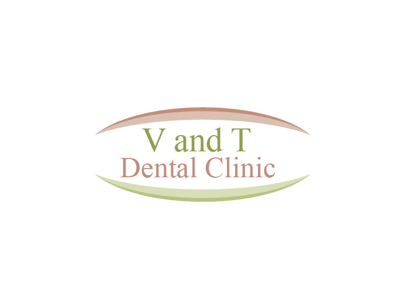
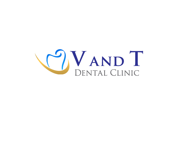
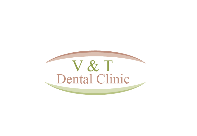
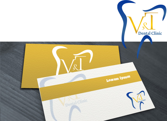
— V and T Dental Clinic
Category → Logo Design Contest
Industry →
Client → V&T
Stats → 105 entries • 24 designers
Prize → $110
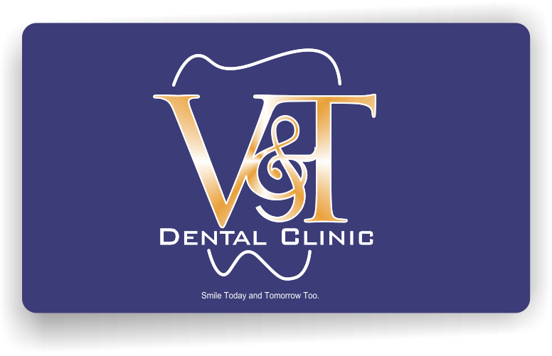
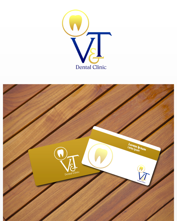
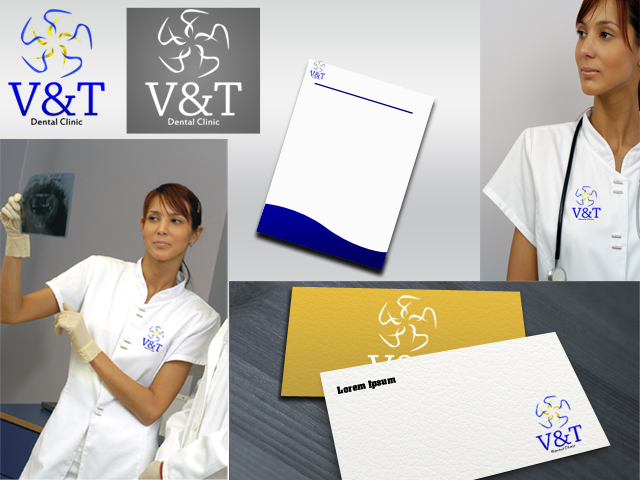
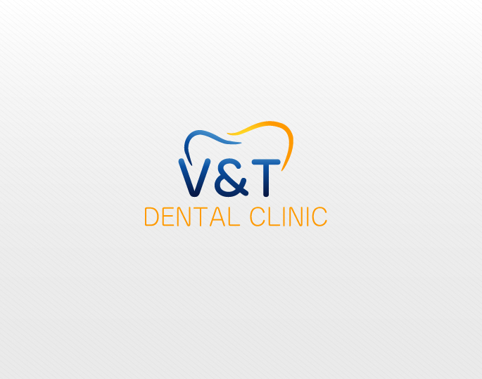
Top Designs


Design Brief
| Contest title: | Dental Clinic |
| Sub title: | V and T Dental Clinic |
| Category: | Logo Design |
Brand Name: |
V and T Dental Clinic |
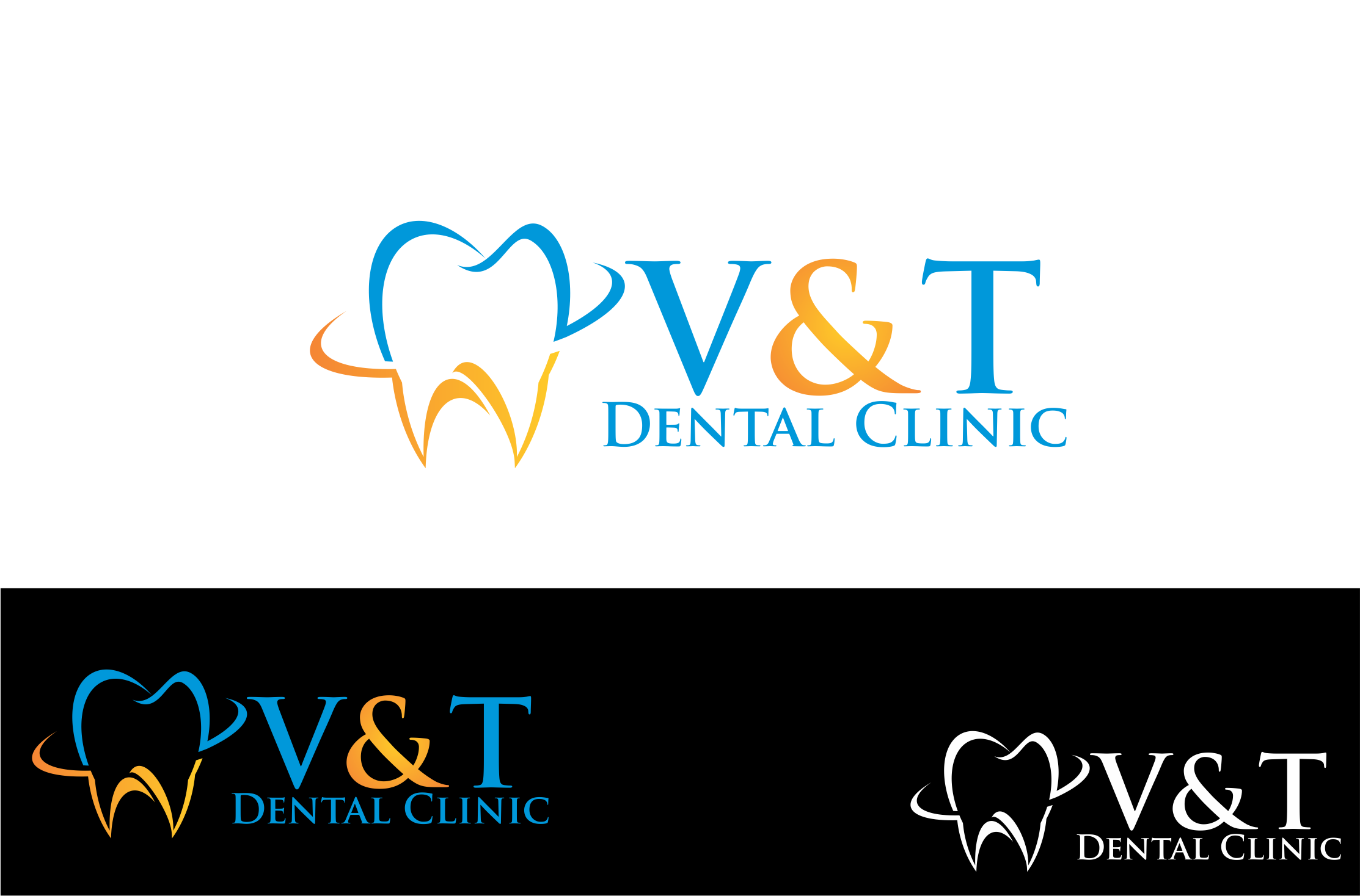
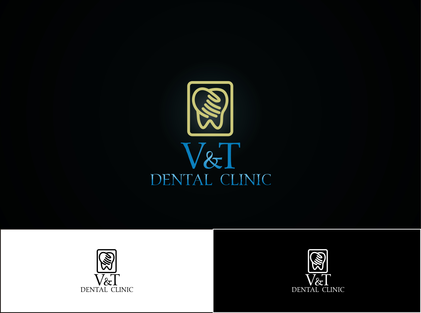
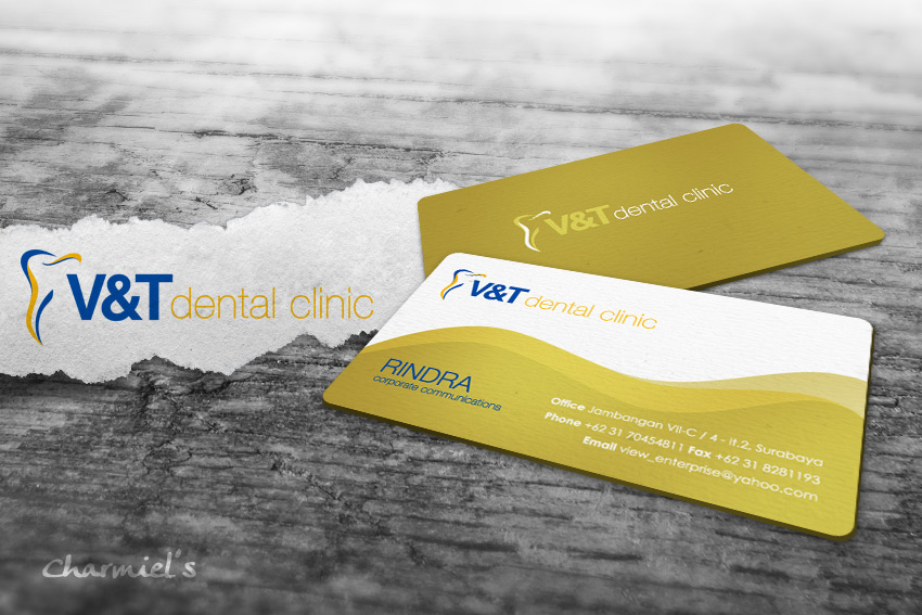
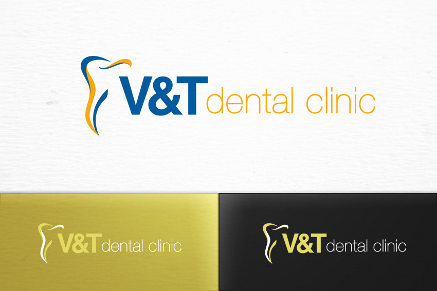
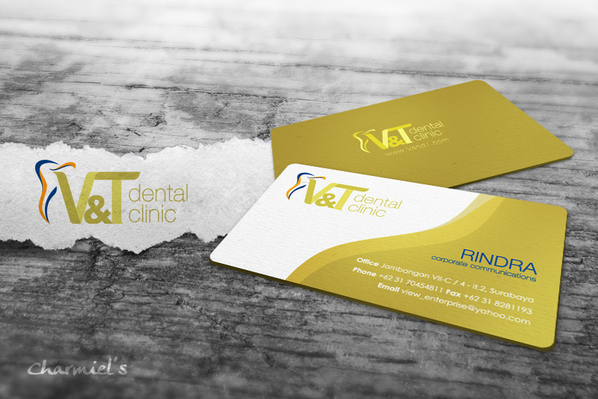
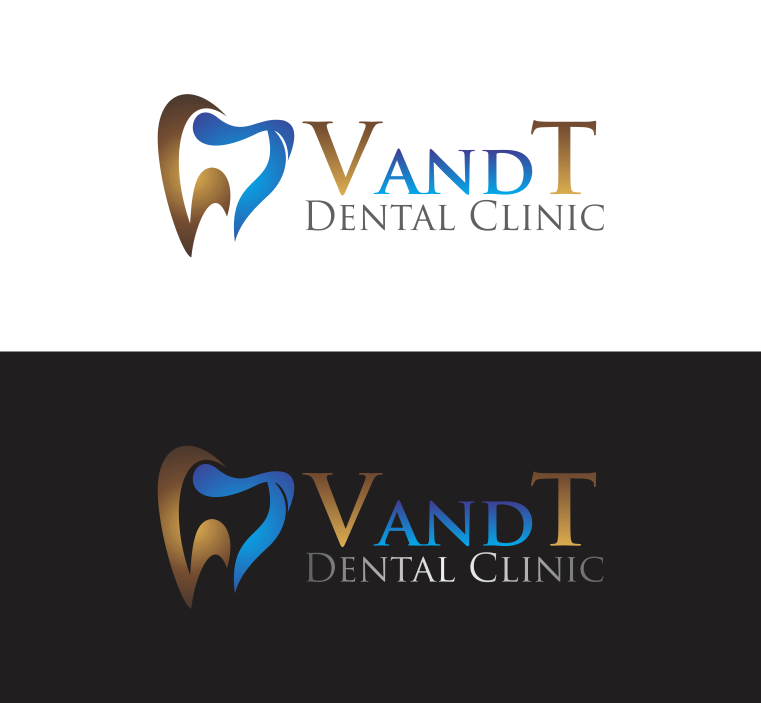
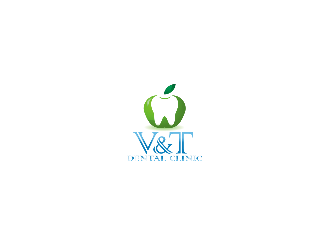
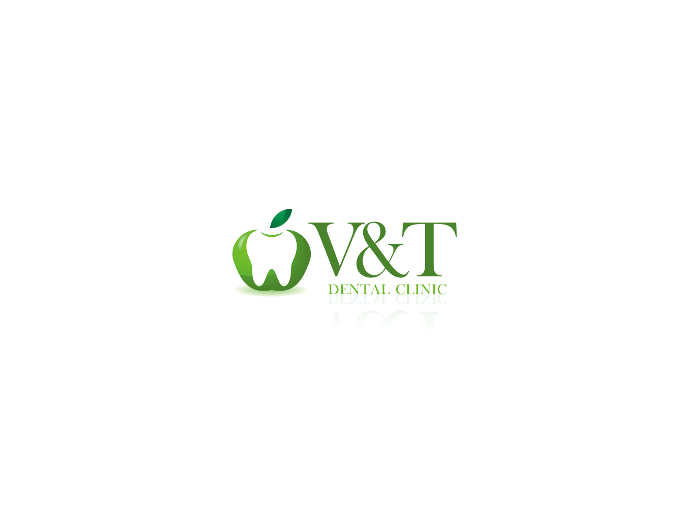
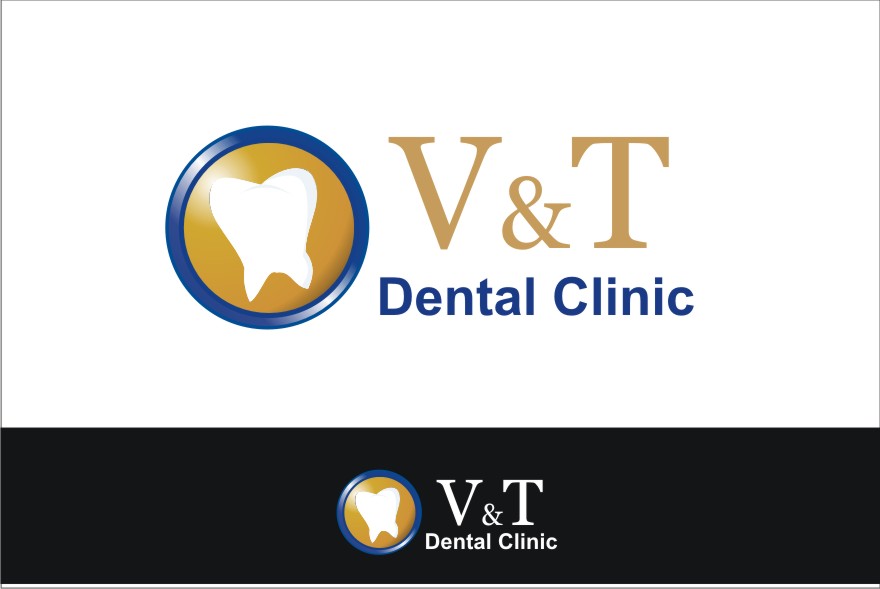
| Summary: | We are an esthetically oriented dental practice owned by two female business partners. V stands for 'Vaylen' and T stands for 'Tori', the two dental doctors. |
| Description: | The logo should be creative and unique as well as it should be feminine and dental related. Please avoid women sketches. Dental related symbols can be used in creative way. |
| Design Goals: | As far as the colors, we like blues and gold. See if anything better you can come up with. We are open. |
| Design No-Gos: | Avoid women sketches. Also do not want it to be busy. |
Contest Attachments
Contest material, sample files and attachments for the contest uploaded by Contest Holder.
| 115_930886247.jpg | Only for ideas | |
| 115_2018635346.jpg | Only for ideas |
About Contest
| Guaranteed $ | |
| Industry: | |
| Created on: | Fri, 16 Mar 2012 14:57:03 +0000 |
| Ends on: | Fri, 23 Mar 2012 14:57:03 +0000 |
| Status: | Winner(s) Selected |
Prize(s)
| 1st Prize: | $110 |
Comments
Vaylen
The competition is very tough and its getting hard for us to select one among such a fantastic designs. Some of designs that are favorites so far have been given 4 stars. Will decide with Tori and some of our staff to get the final results. In the meantime I would like the 4 stars design to be shown in black & white version as well.
Thanks.
Colors that bazz used in #25 and MyDesign used in #33 are the best so far. Like the simplicity yet modern look in #25 and #33. Need some improvements in #8. Keep them coming.
I do not like the diamond shapes in #3.