
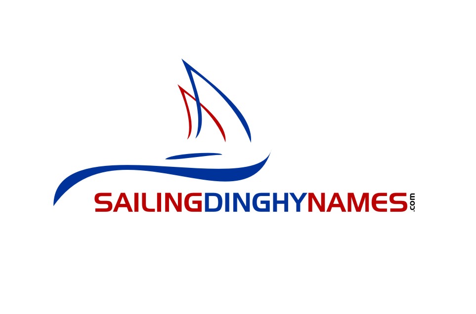
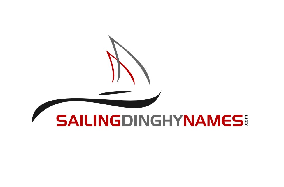
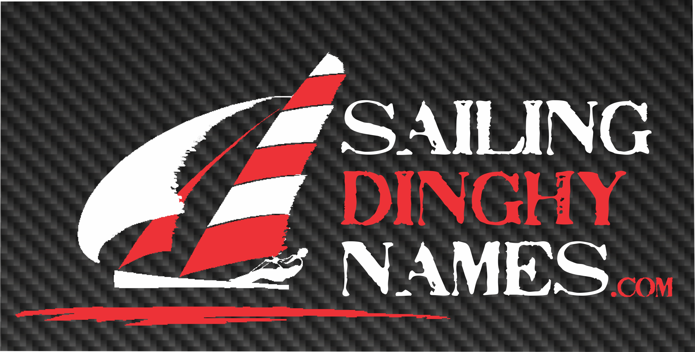
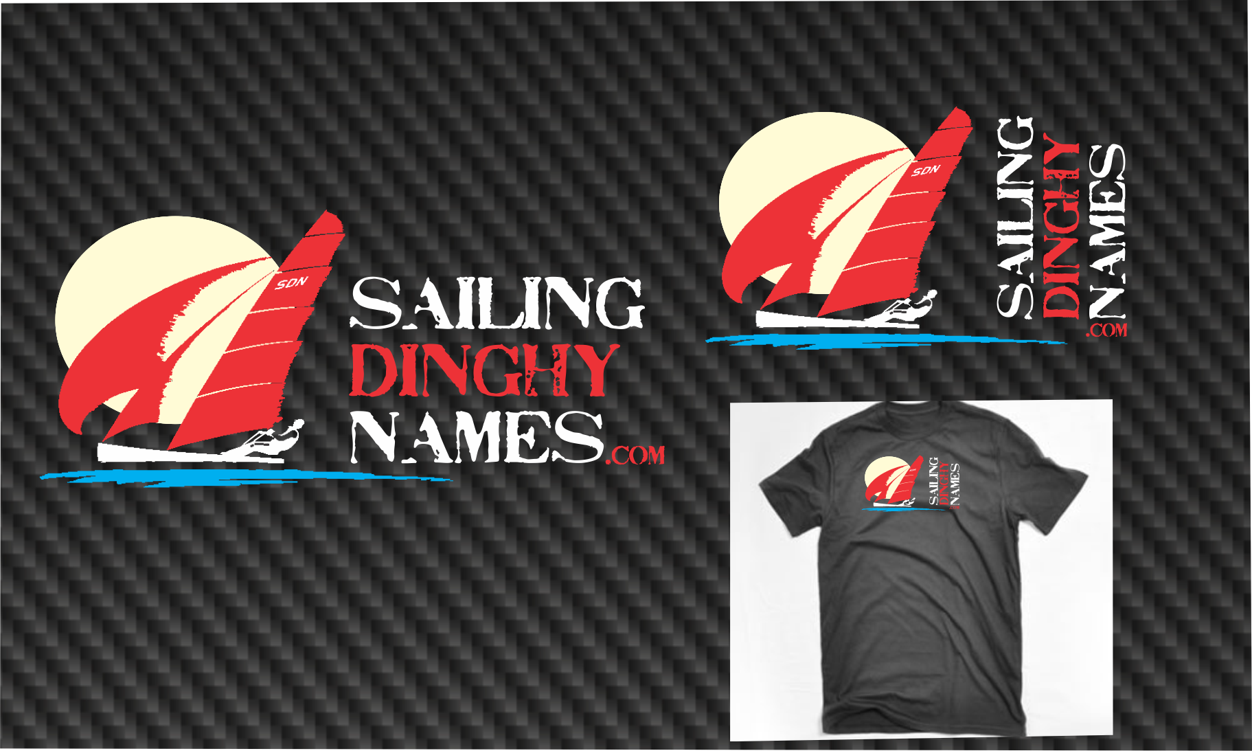
logo for Sailing Dinghy Names .com.au
— SailingDinghyNames.com.au
Category → Logo Design Contest
Industry →
Client → Chris
Stats → 43 entries • 9 designers
2 Prizes → $250$50


Top 40 Designs


Design Brief
| Contest title: | logo for Sailing Dinghy Names .com.au |
| Sub title: | SailingDinghyNames.com.au |
| Category: | Logo Design |
Brand Name: |
Sailing Dinghy names |
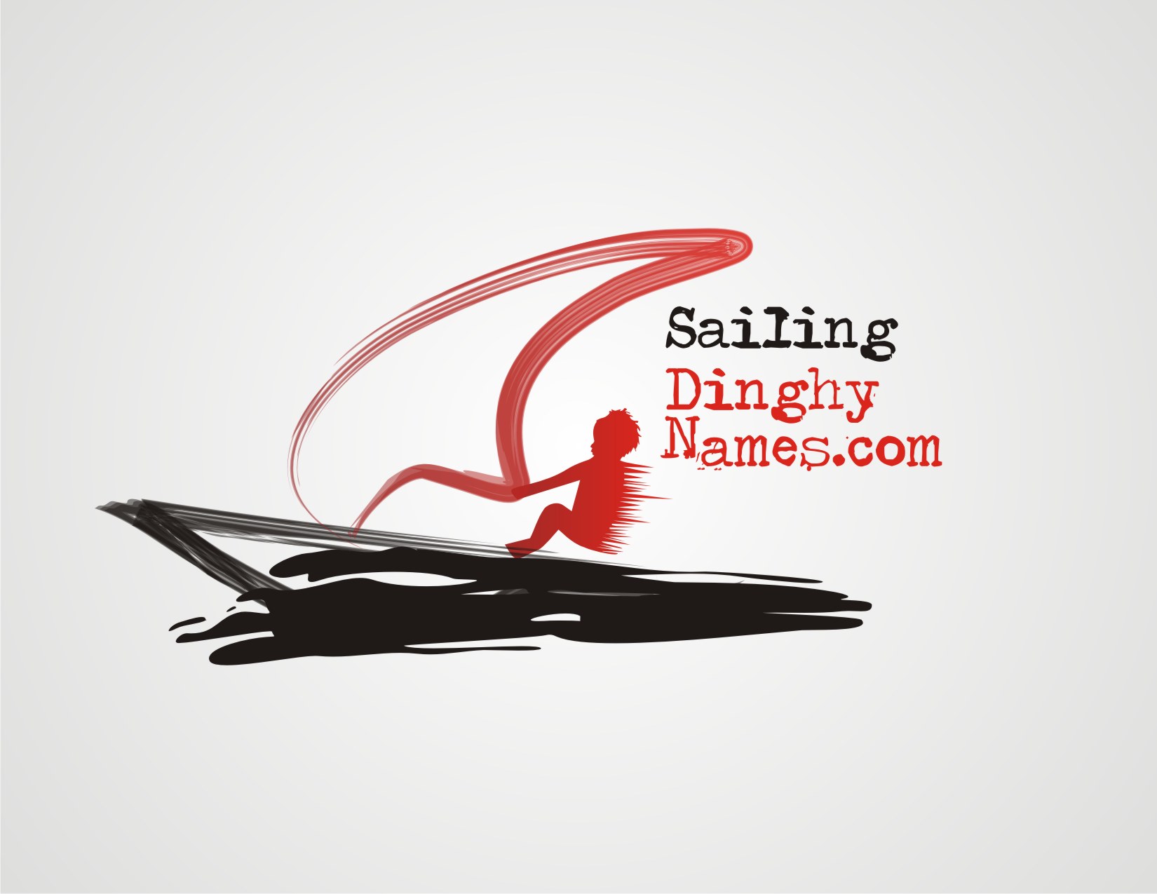
| Summary: | we need a logo design for a website that enables sailing dinghy owners ( normally 8 to 21 year olds) to design and order their boat name and personalise them with graphics. |
| Description: | It needs to be able to work on T-shirts and merchandise as well, needs to look cool so that they want to wear the logo and place the logo on their boats as well as their boat name. prefered colours that seem popular in sailing dinghy gear are dark grey, red and white, I think i would like a very firey red (a bit orange) and the use of carbon fibre texture in the dark grey background. |
| Design Goals: | i have attached a very quick mock up of the sort of style we are after. it needs to convery speed and extreme sailing, needs to have a young person realy leaning out and going fast. look at images of sailing dinghies to see the shape and the possition when they graphic cool design a bit grunge style i thnk. something that works as a stand alone logo with three colours and as a black and white logo or with three or more colours on a t-shirt are going fast, needs to have a spinaker sail, (very round sail at the front) see photo attached |
| Design No-Gos: | don't want the wrong style of boat. don't want anything that does not look cool to kids |
Contest Attachments
Contest material, sample files and attachments for the contest uploaded by Contest Holder.
| 110_679523702.jpg | position of boy really leaning out when going fast | |
| 110_1554254517.jpg |
About Contest
| Guaranteed $ Featured | |
| Industry: | |
| Created on: | Fri, 02 Mar 2012 15:59:10 +0000 |
| Ends on: | Fri, 09 Mar 2012 15:59:10 +0000 |
| Status: | Winner(s) Selected |
Prize(s)
| 1st Prize: | $250 |
| 2nd Prize: | $50 |
Comments
also maybe play with different wording
also on a white oval with a carbon fibre background version would be good
Thanks.
Admin
110designs.com
#3 #4 #5 are all to young kid like, for younger then 8 years old i think, if we target 16 year olds then kids younger and older will still like the design
#1 #2 too corporate
Some things you have missed in the brief:
1. The logo has to have a person in it leaning out and the sails need to be leaning back at an angle to give the impression of speed.
2. The orange is much to orange, should really be red with a bit of orange in it. needs carbon fibre somewhere
3. Would like a Spinaker sail at the front of the boat
Also i think the font should be more modern, (sans serif) maybe something like Handel gothic
thank you for your efforts