
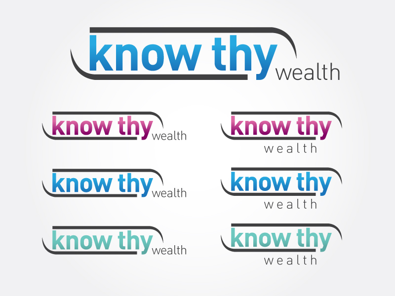
Simple but Bold Logo Design Needed
— provide revolutionary portfolio reports and analytics
Category → Logo Design Contest
Industry →
Client → mary.luciana
Stats → 36 entries • 18 designers
Prize → $175
Top Designs


Design Brief
| Contest title: | Simple but Bold Logo Design Needed |
| Sub title: | provide revolutionary portfolio reports and analytics |
| Category: | Logo Design |
Brand Name: |
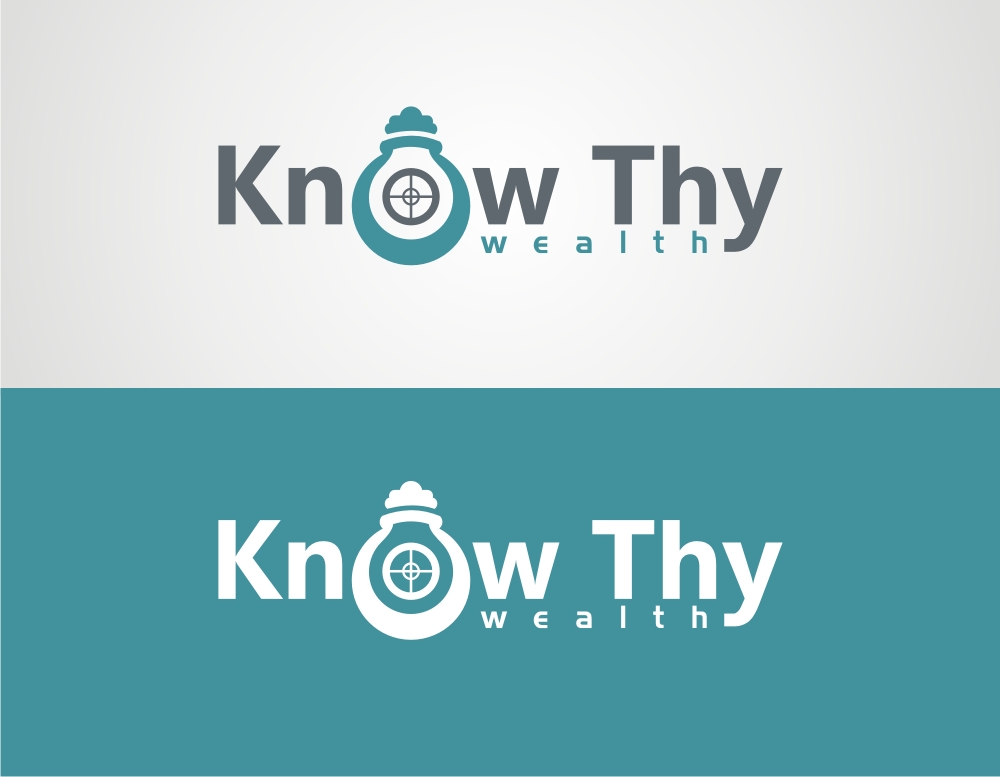
Know Thy Wealth |
| Summary: | The Oracle of Delphi has the inscription (sometimes known as the Socractic Oath) of "Know Thy Self." Know Thy Wealth will provide revolutionary portfolio reports and analytics to give people / advisors the ability to understand the inherent risks and rewards regarding the investment choices they or their advisor have made. |
| Description: | The Oracle of Delphi has the inscription (sometimes known as the Socractic Oath) of "Know Thy Self." Know Thy Wealth will provide revolutionary portfolio reports and analytics to give people / advisors the ability to understand the inherent risks and rewards regarding the investment choices they or their advisor have made. I am looking for a simple, yet bold logo my first thought is incorporating a white beard (reminds me of Socrates) but I am open to suggestion. Logos I like: - Infoglyphs www.infoglyphs.com - axius studios http://tasteofink.com/assets/images/gallery/log... etc. |
| Design Goals: | The Mantra of Know Thy Wealth is to "Educate & Empower" A logo that is able to communicate wisdom, empowerment, and knowledge is what I am looking for |
| Design No-Gos: | No stock icons. |
Contest Attachments
Contest material, sample files and attachments for the contest uploaded by Contest Holder.
No attachments yet!
About Contest
| Guaranteed $ Featured | |
| Industry: | |
| Created on: | Sun, 09 Oct 2011 20:57:25 +0000 |
| Ends on: | Sun, 16 Oct 2011 20:57:25 +0000 |
| Status: | Winner(s) Selected |
Prize(s)
| 1st Prize: | $175 |
Comments
don't like the placed of 'w' in #10, #12. Like the implementation. #13 is too complex, please try to be simple. #11 try the size of the O same as the other alphabets in 'know'. try the different and creative approach for bulb implementation. #16 has the same comments as #11.
#14 is good.
#15 is unbalanced. try another concept please.
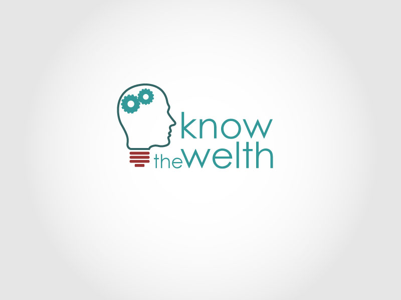
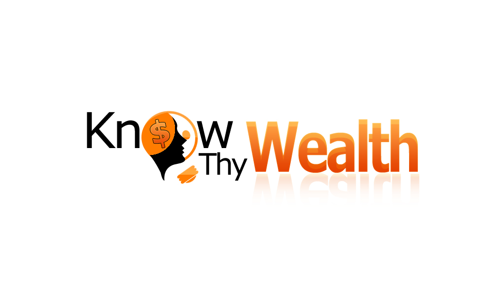
Really like the concept of the gears in the human mind in #17. please note you have spelled wrong its 'Know Thy Wealth', not 'know the welth'. Try to make money interpretation in it.
#18 to #20, really like the 'w' concept of wealth to make it the bottom of bulb. #20 like the cloud concept as well. Try more color variations.
#21 to #22, love the concepts of how e is connect to the word 'know'.
Thanks to all designers. its 2 days to go. coming them in and work hard. thanks
#7, #6 please try to be more creative and conceptual. thanks for your work.
thanks.
#4 I don't like the implementation.
thank you.
thanks.
thanks.
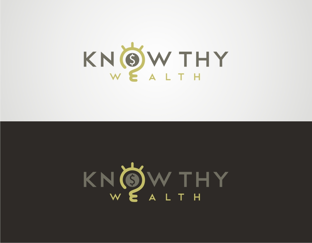
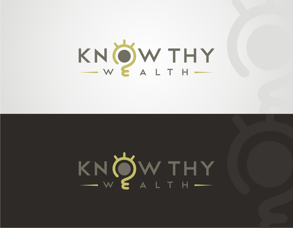
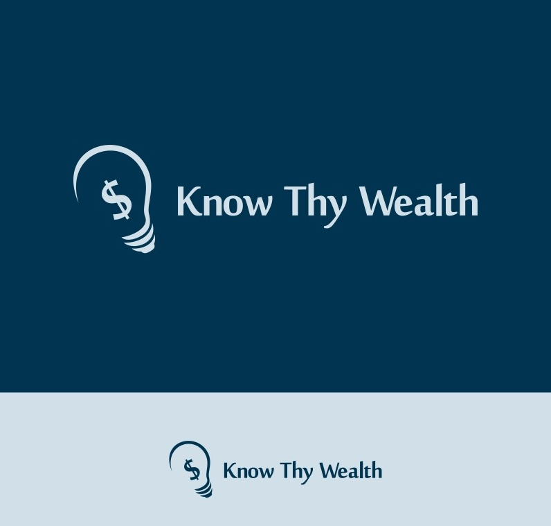
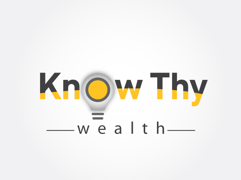
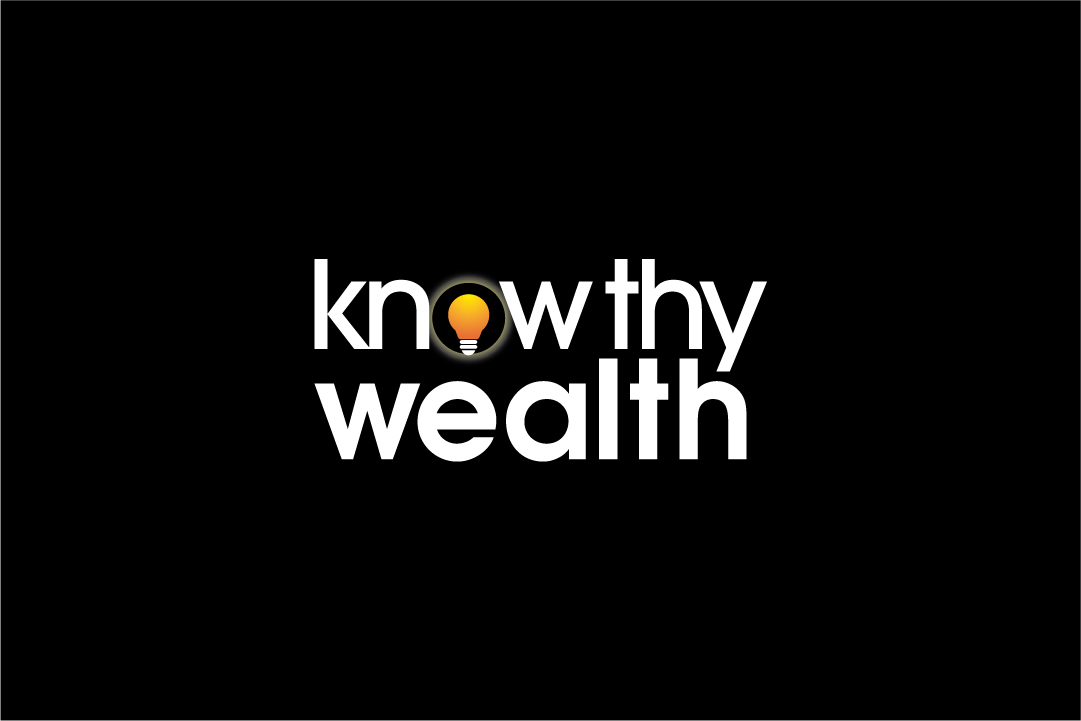
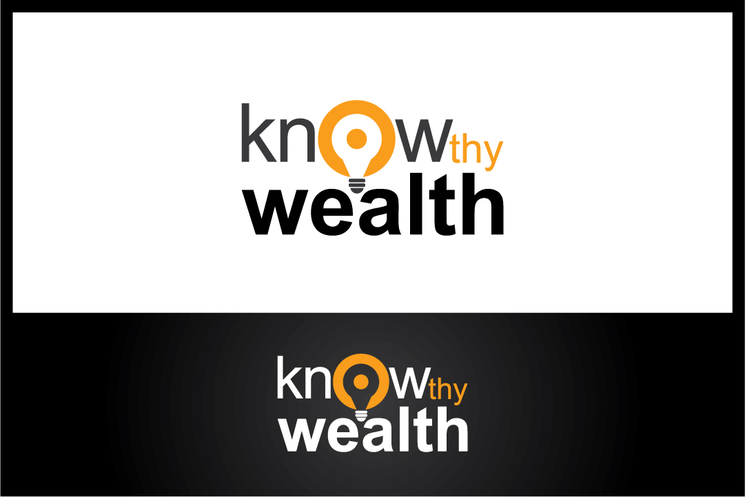
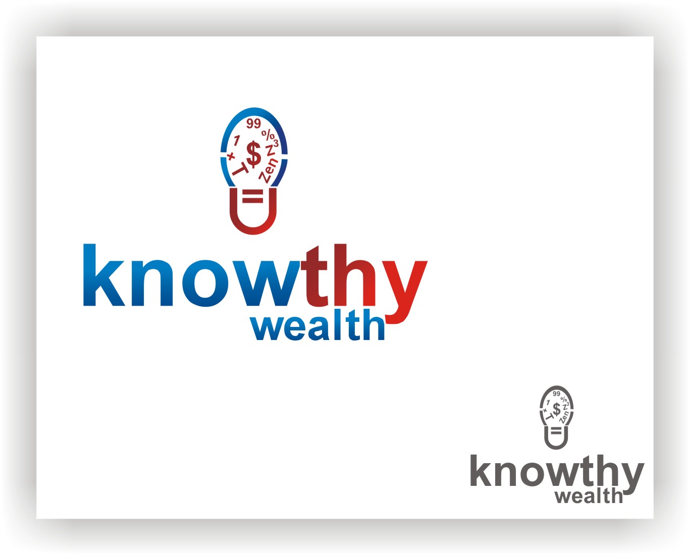
One thing I thought about what the "O" in "Know" incorporating a lightbulb, representing knowing, innovation, and ideas.... just a thought.