Designing a corporate brochure needs to have an attention for what the client wants. Should you have observed if there are brochures stacked up on the table, there’s just one single that is brought out from the whole lot! Why is an individual chosen that single brochure from the entire collection?
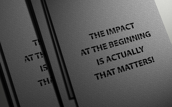
The actual answer is based on the cover or title page. Of course, the cover appeals to the individual to grab the particular brochure from the entire stack. Brochures ought to be designed with a solid marketing cover on there. Your brochure must be able to promote your product or service at the very first look. This really is just like ‘love at first sight’, such as the impact at the beginning is actually that matters. Thus, for any corporate brochure design the initial stunning impact is going to be created straight from the cover.
The cover will need to have the elements of a commitment of an incentive when the person reads through it. A lot of companies provide something at no cost, which will lure clients to read more. Additionally, top cover has its own marketing strength stamped within the cover by selecting the most appropriate image/picture and catch phrases to draw in readers.
The next aspect depends on the colors, text sizing and exactly how exciting you will make the brochure to your target audience. When you have no pictures, and colors, just envision how unappealing your brochure would look. Remember to keep under consideration; a lot of the brochures aren’t read throughout. You have to split your textual content into small sections, each one having a suitable heading and subheading. All these headings must be phrased to the extent that the reader can get what it’s all about even though they do not go through from any of the textual content written as explanation of the sections.
Pictures/Images, it is said, count a thousand words. Why then spend a great deal of time in writing when all you have to do is put in a picture that will present your readers the entire concept? By means of including appropriate pictures, it will be easy to say the written phrase. Usually do not place any and each picture that you just obtain at no cost. Make initiatives of creating or getting one that articulates perfect for your products or services. The design need to reflect people in action using your product. Check out among the best recognized brands, and you will observe that people exhibit the way their products work for them.
The last but vital part of the brochure is to call your reader to take some measures. And here, you are going to invite the reader to visit you to purchase the solution. Among the list of frequent blunders made in this is certainly that the essential details are ignored; contact information. If you have skipped this, regardless of how your brochure seems, it will be useless, since the reader will never know from where they will purchase the valued product. A few of the details really worth bringing up are the logo, address, email, and phone numbers. You can also put in a location map to lead your visitors to you. In case you are based near to a well-known landmark in the city, it becomes truly worth referencing it.
Subscribe to our Newsletter!


