A logo for any business consists of a symbol signifying a product or company. Logos regarded as a company’s tangible resource which, if effectively done, could benefit the business. A logo speaks a company’s personality and value. Consequently, logos needs to be carefully designed and ought to differ from product to product.
There are a large number of businesses competing in the marketplace and few of these stand out. Selected number of brands are highly regarded and kept in mind for a long time giving the company success. For instance if we consider Pepsi logo, we observe that it has put in years in the industry serving the company. This logo does not need for being associated with its name; the logo sign declares everything.
Well-known company logos are observed and applied as the foundation of branding and promotion strategies of the companies they speak for. Brands like Adidas, Coca-Cola, IBM, Fedex, Shell and McDonald’s have proven themselves as business titans as well as leading trademarks around the globe by strengthening an incredibly effective branding attempt using a strong logo design which has grabbed the globe!
Popular logos have these two elements in common – uniqueness and simplicity. What is vital to see here is that logos facilitate clients determine a business. The more unique a logo is, the more famous it becomes. The more complicated a logo is, nevertheless, the more unlikely it will be that folks will keep in mind.
Let’s evaluate a few of the popular brands to see what makes them dominant in thousand other brands.
Apple
Since the initial logo was complicated, Steve Jobs hired graphic designer Rob Janoff to create a simple but unique logo. Ultimately Rob designed the renowned “Rainbow” logo that was so distinctive that it stayed outstanding and unchanged for over two decades. It shows the rainbow colored shape of an apple having a bite taken out of it.
The fresh glass-themed variation of Apple logo carries a silvery chrome finish giving a brand new millennium glance. It can commonly be observed on all Apple products and stores; and has become among the world’s most famous brand symbols.
Fedex

FedEx Corporation formerly named FDX Corporation, is a cargo airline, courier and printing company, located in Tennessee, United States. FedEx is an acronym of the company’s original name, Federal Express.
The font of the Fed Ex logo is a simple one. The Fed is always purple along with the Ex is in another color for every division. For FedEx Express, the overnight courier services the Ex is Orange.
The FedEx Logo contains a secret element in it. Except if someone highlights the hidden component most of the people usually do not observe. The brand includes a right-pointing arrow based in the negative space between E and x. The secret sign represents the speed and perfection of this courier company. The impressive arrow represents a gentle way of subliminal promotion denoting forward activity and considering the company. As you can imagine the logo won over 40 awards and is considered the best creative design ever.
Adidas
The Adidas logo contains the benefit of being very simple comprising of just three straight, parallel bars. This apparently simple logo is one that could be easily recalled by the public and still is unique enough being a legitimate brand. Even though the idea of a three-lined logo doesn’t specifically appear to be sufficient to differentiate it as a logo, what Adidas performed with those lines by angling the three lines to signify a mountain, which may be believed to depict long term challenges of the athlete, really does distinguish them. It could represent not just a mountain but additionally it relatively forms the outline of an “A” for Adidas.
The font is also simple and thus unforgettable. It doesn’t have any outlying jaggies or feet. It’s something which will remain in the viewer’s mind and is also easily readable far away.
Shell
As mentioned over, like the majority of successful logos it seems like an easy and simple design when initially seen. This can be an element that the person doesn’t need to focus on to keep in mind. The businesses name, located in the bottom of the logo, is also simple but eye-catching. The border of the design, although solid, isn’t going to overpower the design itself.
Shell’s logo is a simple design which talks to tradition yet still time permitting development and growth in areas that it might not be observed as included in at this time. These attributes made the Shell a famous design around the world.
Pepsi
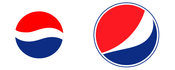
Reviewing the history of the Pepsi logo, we just realize that it progressed towards the logo that nowadays is among the most familiar logo in the market. The essential design, the blue and red ball, never changed. The uniqueness and simplicity is the key strength of the logo.
Subscribe to our Newsletter!


