We’ve been continuously looking for Olympic Games via main stream media as well as social media several times in a day and each time the tricky logo for Tokyo 2020 Olympics comes up in front of us. Currently, we are at the end of Olympic Tokyo 2020, so I thought to share you with a creative design tip behind the production of Tokyo Olympics 2020 logo design. The Tokyo 2020 logo trick was originally posted by one of 110Designs’ top designer CreativeAlys.
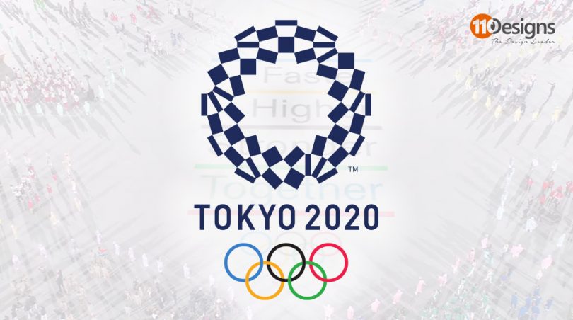
See, if you look at the logo of Tokyo Olympics 2020, there are multiple squares, rectangles, horizontal and vertical bars which are angled in a creative way to form a circular emblem. The different styled shapes demonstrates a number of different games included in the world famous sports event initially scheduled to held in 2020, but postponed due to the Covid-19 Pandemic worst situation and now going on in Tokyo, Japan, with the same Tokyo 2020 logo labeling.
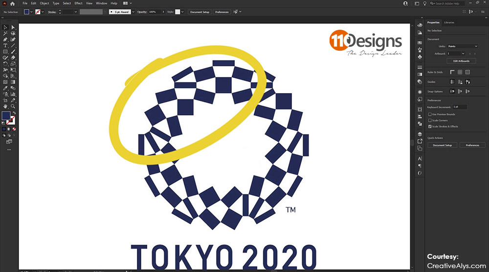
While focusing on the logo symbol we will start seeing that it is a repetition of a set of shapes. Check out the image of the logo below, I have highlighted a part of the logo for you to better understand the trick that was used to create last year’s Olympics logo. If we rotate that part of the logo thrice in a circle, we’ll have the full logo design that comes out in the end.

Watch the video below from CreativeAlys for a more comprehensive way of creating the Olympics Tokyo 2020 logo design in an efficient way by using Adobe Illustrator. The video also demonstrates how you can create the original Olympics Interlocking Rings in Adobe Illustrator.
Need a logo designed? Start a logo design contest now.
Subscribe to our Newsletter!


