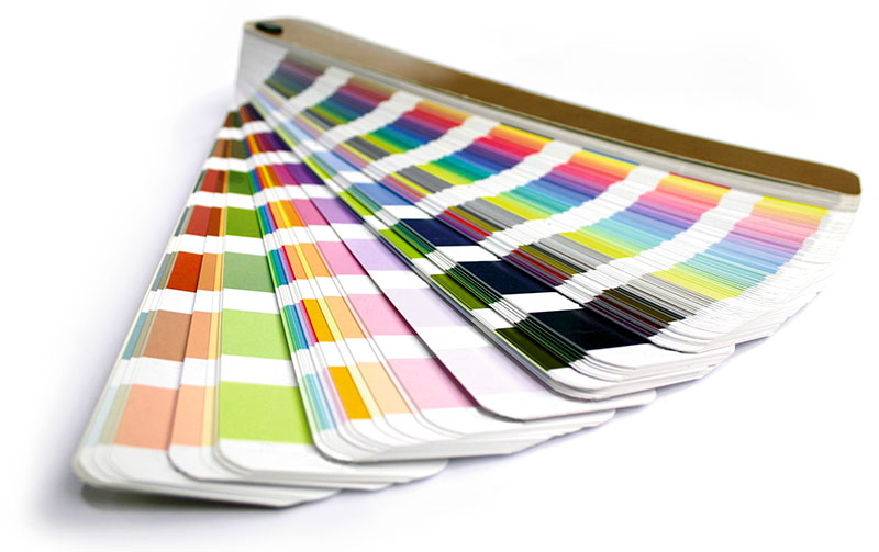
Picking colors for your logo can be difficult. Just how do you go about choosing appropriate colors? Everyone has favorite colors, and many people also have colors they hate. But, whether or not you personally like a color actually has little to do with its appropriateness for your business’s brand.
You should make your choices based on the colors that will best perform the color palette’s jobs.
What are those jobs?
The color palette’s jobs include:
- Telling your brand’s story through color psychology
- Laying the color palette foundation for your Visual Vocabulary
- Giving your logo elements light and dark contrast
- Having enough colors to be interesting but not so many that printing’s too expensive
- Complementing each other and creating visual appeal
Let’s go into more detail on each of these jobs.

Telling your brand’s story through color psychology:
Colors all have different psychological meanings. And each color can have several meanings, depending on the context in which it is used. For example, red is a “hot” color that can also display urgency, signal “stop,” and demonstrate love and passion. So, depending on the messages that are communicated by the other elements of your logo, such as the icon, font and other colors, it may be possible to interpret the meaning of each color in the palette in different ways.
Laying the color foundation for your Visual Vocabulary:
Many small businesses think they need to put every color they want to use on their marketing materials in the logo itself, and they wind up with a logo that looks like a crazy rainbow. In fact, you just need to include your main brand colors in your logo. Your main brand colors are usually the one, two or three that best represent your company. You can then augment your logo’s color palette with additional colors from your Visual Vocabulary when you design your marketing materials to get more of a full-spectrum impact.
Giving your logo elements light and dark contrast:
Your logo will be made up of several elements—the parts of the icon and your company name. Making sure that those elements have different color values, meaning that some colors are light and some are dark, will do a couple of things for you. First, it will give your logo a feeling of liveliness—and that will make the logo more eye-catching. Second, it will help to distinguish the different elements from one another—both by giving them more variation and different basic values. This has the added advantage of helping color blind viewers who see your logo to see it more clearly.
Having enough colors to be interesting but not so many that printing’s too expensive:
Whether or not this is actually an issue for you depends on whether you’re planning to print your materials on a traditional press or digitally. If you’re printing on a traditional press, the printer will charge more for the job the more colors in your piece, so you want to use just two or three colors. (One color is often not enough to provide visual interest.) Using more than three colors in your logo often makes printing quite expensive. If you’re printing digitally, then the number of colors shouldn’t be as much of a concern, because digital printing uses a full range of colors.
Complementing each other and creating visual appeal
You don’t want to choose colors for your logo that don’t look good next to each other. If you’ve chosen colors based on their psychological meanings only, or if you’ve concentrated too much on level of contrast and overlooked whether or not they coordinate with each other, then you can wind up with clashing colors. Also, placing colors next to each other can change their visual appearance. For example, if you put aqua next to sky blue, then the aqua will look bluer. If you place the same aqua next to a green, then it will appear greener. So, choose colors that complement each other and that make each look more appealing.
If you keep these five jobs in mind, then you’ll choose colors for your logo that are appropriate for your business rather than being based on your personal likes or dislikes.
Subscribe to our Newsletter!


