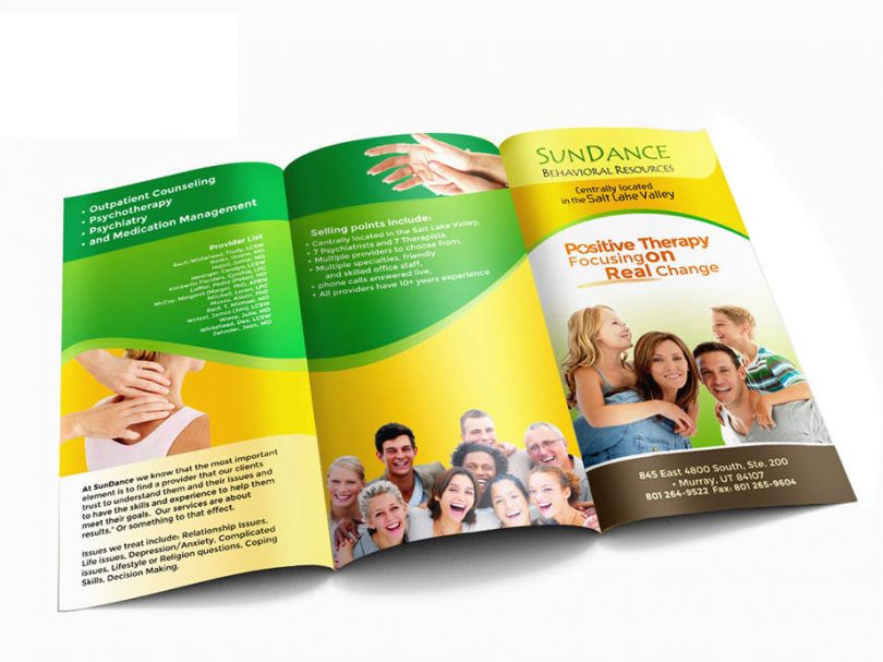
A brochure in all its simplicity is a pamphlet that is use for marketing your product or service or provide information about it. The brochure will speak to readers you have never met and will try and convince them to come to you. In other words the brochure will be representing you; since it is your impression you would want that the impression to be good. Given below are some of the tips that are required for you to keep in mind while designing a professional brochure.
Purpose
The starting point of making a brochure is its purpose. Your will need to know what actions are to be achieved with a professional brochure design. The best way of doing this is to record your thoughts on paper. You should record everything that comes to mind of what you would want to have included in the brochure. Some points could be a brief history of your company and what you deal in., testimonies of clients that you have dealt with, contact information (often an important element that is forgotten).
Design/Layout
Once you have decided on what you would want on the brochure you will then have to see to the layout. This is an important to the brochure as the design will leave a lasting impression on your readers. Here you would include how your cover page will look like where pictures will go and how the text will be formatted. The layout of your brochure should have three essential things the name of your product/service, company prominently so that it is not missed out.
Writing Style
Your writing will do the speaking for you to your readers. Keep sentences short to increase clarity and avoid confusions. If the sentences are long you will have a nice long document and no one likes to read long documents as they are regarded as boring. Some key words that can be used in your work are save, new, results; guarantee, free, proven, sale, etc.
Headings
If you want a certain section of your text to get more attention you can put a heading to the section. The heading should catch the readers attention one can do this by making the print bolder than the rest, using different colors and a bigger font.
Grammar and Spellings
This is a weak point that many writers face and thus the content should be double checked for errors related to Grammar and Spelling. Your content should be error free of these mistakes.
Color Combination
Always remember that certain colors do not do well with the eyes. The foreground and the background should well blend with each other; generally the background should be light and the foreground should be dark. However it depends on the nature of business that may switch the positions.
Paper quality
Last but not the least is the paper quality. If you are presenting the brochure in a high profile society than the paper quality should be great as well. Discuss this issue with your printer he and you will come to a decision on which paper to use. The charm of the brochure is all lost if the paper quality is not good.
Subscribe to our Newsletter!


