Banner designing at its best
Banners continue being the old—school form of advertising that hasn’t lost its charm. Moreover, with social media platforms taking over and experimenting with advertising, banners have found their place too. As a result, companies of all shapes and sizes are using banners to advertise, boost visibility and get attention from the audience toward their website.
An excellent banner design can boost brand visibility and site traffic, which will also increase the revenue and profit margin of the business. This targeting method is used at different levels by re-targeting the customer based on their behavior. The best banner for your business cannot be created overnight but is a result of strategic decisions and the implementation of tips that have helped businesses before.
What is a banner design?
A banner is one of the most prolific marketing methods today, especially in the digital space. The best aspect of banners is that they can be created in all shapes and sizes. However, a banner design can be successful and effective only when it receives the maximum number of clicks.
Banners act as advertisements where companies can promote their products/services with a link to their own website. Therefore, most companies utilize them because they are an affordable, practical, and measurable medium of the brand’s awareness in the industry. Furthermore, since they can be customized and created in the most attractive designs, designers have greater freedom to exercise their ideas and turn their art into reality.
Six tips for creating the most effective banners for your business
While creating banners is usually uncomplicated, there are certain pitfalls in the creative journey. However, with the following tips in mind, you can ensure that you don’t lose focus and create the most successful banner design that delivers promising results.
1. Define the purpose of the banner
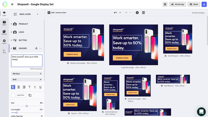
First and foremost, you need to define what your banner is all about. Do you have a specific purpose for creating it, for example, to improve the brand image or increase brand awareness? Then, using a banner customizer tool, you can quickly develop banners that speak to your target audience.
The following are some factors that you need to establish as the purpose of creating the banner:
- Rebuild or shift brand perception
- Improve brand awareness
- Emphasize a new product
- Get more attention towards a sale or a promotion
- Create a community
- Promote an upcoming event
- Raise awareness for a social cause
Multiple other reasons will guide you in the banner designing process. Some purposes are meant for the long—term, while others aim to fulfill an objective in the short—term. Once you have your purpose and goal in place, all other stages of this process will become more manageable. Knowing why a good banner needs to be made solves half of the roadblocks in the creative aspect of designing.
2. Location and surroundings of the banner
After establishing the purpose, you need to check for the environment or the surroundings where this banner will be put up. For example, it could be on a highway, at an event, or even on a virtual platform. The banners’ placements and surroundings significantly impact its success and shouldn’t be taken lightly. For your banner to be noticeable to the audience, you must allow it to pop from its surrounding.
For example, if you place a banner that has a prominent red tinge on it over a red-brick building, it won’t be helpful at all. You could also incorporate a black and white border on the banner to stand out from its surroundings, physically or virtually. Banners that don’t traditionally blend into their surroundings will successfully gain attention. It is also possible that people will remember such banner designs even after they no longer exist.
3. Choose the right colors
A simple color scheme shouldn’t be the only thing that guides you in creating your banners. Experienced graphic designers know the impact colors have on the audience’s minds and carry different meanings. People form a brand perception primarily based on the colors used.
While colors have a unique image attached to them, using colors that resonate with your brand is equally essential. If you wish to bring more brand awareness and visibility, the colors associated with your brand should be highlighted more. Different hues of colors can also be used to stand out. It is preferable to work with a print company with a broader color palette than others.
4. Incorporate high—quality images
Whether it’s graphics or photographs, you need to offer catchy images to enhance your banner design. Unfortunately, a common mistake brands make here without realizing its impact is ignoring the quality of the pictures used. No matter how compact the banner may look on a computer screen, the pixels may blow up when the banner is created in a more extensive layout.
To make your image look clear and sharp even when enlarged, you need to use the correct file type with a high resolution. You cannot randomly pick and apply pictures from the internet. There are two main types of images that you should use in your banner:
- Raster images: Raster or bitmap images comprise tiny dots forming a picture. These images can be enlarged only to a certain extent, or they will lose clarity.
- Vector images: Vector images are line art graphics that will retain their quality, despite their size.
When you create graphics for your banners, save them in vector format, so they don’t lose quality. In the case of raster files and other common file types, save it at an appropriate output resolution size. These simple steps will help you create an overall high—quality banner.
5. Keep text concise and readable
Although images appear sharper when viewed from a distance, the same can’t be said about text. So in the case of an outdoor banner, the text should be placed at a suitable size so it can be read from afar. Additionally, the font you use also impacts the readability. Use clear fonts that make the alphabet easier to understand.
Your banner size should decide the placement of the text. Because a banner is wide enough, you cannot spread text all over the banner. The people who view the banner will typically not spend time reading the content on your banner. Therefore, keep the text concise so that the audience reads it in its entirety in the shortest time.
6. Give a call to action
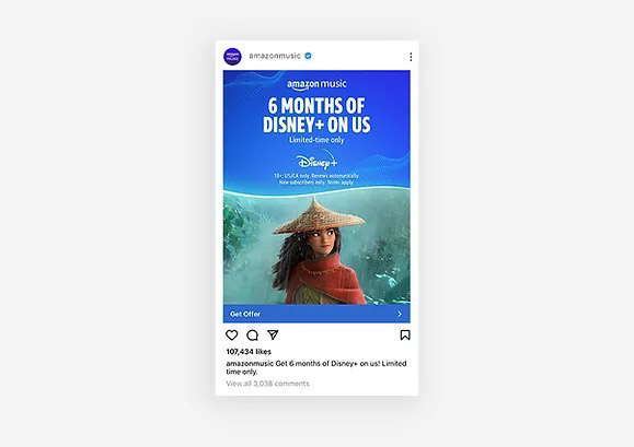
The goal of a banner is to encourage the reader/viewer to take the following steps. Your banner design can be successful when it has a clear call to action incorporated into its design. Add more details to the CTA, such as the website link, contact details, and more, so that the person knows which direction to go in. Remember that your CTA should stand out, and all other elements should compliment it.
Conclusion
Whether the tagline or the colors, your banner should stand out and become a fond memory in the viewers’ minds. You may make some mistakes in the initial stages, but they can be corrected when you keep these essential tips as the foundation of the banner design. Take the help of designing tools to make the creative process fun, more straightforward, quicker, and more effective.
By B Naomi Grace
Subscribe to our Newsletter!


