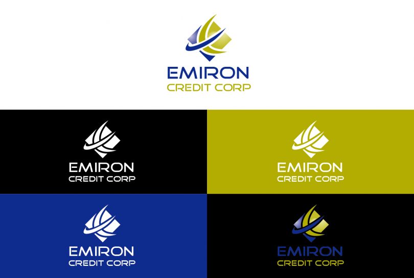
A logo should be appealing to its clients. As logos tend to be with a company for a very long time, care must be taken not to associate a company logo with a specific service or product. This is especially if the company has future prospects of becoming a highly productive company, and expanding its line of services and products to incorporate other new ones. Logo designs are a reflection of the companies’ name. They are developed basically to enhance the popularity of the goods and services offered by the respective company to the general public.
The designs of a logo vary according to the nature of the company concerned. If the company is radio based or involved in the promotion of rock music, then more informal or freestyle fonts are used. Radical images of guitars are also used, together with a palette of rich colors to invoke feelings of excitement among music fanatics. In contrast to this, accounting logo designs tend to be more conservative and formal based. The following are the basic salient features of a good accounting logo design.
Choice of color
The colors blue and the family of green are popular among accounting logo designs. Both these colors lend a certain extent of professionalism to the overall design. Accounting logo designs usually consist of a mixture or two or three colors blended together to give that feeling of innovation. The color blue helps in giving that feeling of trust and dependency among its clients.
Fonts and writing styles
Accounting is a formal based profession. Therefore, the choice of fonts is more straightforward. Fonts like Times New Roman and Ariel will do. The fonts should reflect the formal personality of the business, and should have the ability of targeting financial investors, Chartered Accountants and other financial personnel. Among some of the common terms used in accounting logo designs is the word ‘tax’. This is simply to illustrate to its onlookers that the respective accounting firms specialize in tax-related issues, such as income tax, sales tax, Value Added Tax, etc.
Nature of Graphics
Accounting logo designs do emphasize much on complexity when developing the company logo design. Logos should suit the ideas that the company is trying to propagate among its customers and clients. Simple, down to earth graphics are considered to be suitable for such logo designs. Yachts and outlines of bulls are common graphics executed in accounting logo designs, as they depict finance and integrity in the sight of accounting.
Subscribe to our Newsletter!


