Medical Logo Design
Stand out with a healthy dose of creativity
Starting at only $110, you'll have your pick of dozens of original logo designs created specifically for your medical practice. Whether you're a doctor, insurance biller, office manager, or other professional in the medical industry, our expertly crafted logo designs will boost your practice’s exposure.
- Tell us what you want in your ideal logo.
- Dozens of designers submit logo designs for you to review.
- Communicate with medical logo designers right on site.
- Only pay for the logo you like best.
How logo design contests work
Compile your design brief
Review & provide feedback
Pick a winning design!

What our customers say about their logo designs

It's an awesome idea getting multiple designers to compete for your logo.
Paid $145 for 39 concepts.
We were amazed by the number and quality of the designs submitted.
Paid $160 for 73 concepts.
It was great to have so many creative brains working on my logo design!
Paid $150 for 138 concepts
Leading Marketplace for Medical Logo Design. Over 3,000 happy customers. You're Next!

Features of Medical Logos
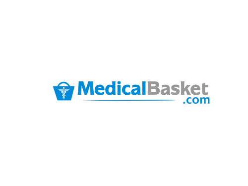
Health is a very serious and sensitive issue for most people, and that’s why designing medical logos is a very tricky task. The designer has to create an image that’s creative enough to say something about the services being offered, and yet be sober and sophisticated at the same time. For instance, notice the general air of sobriety for these brand designs.
It becomes a challenge to create a sophisticated identity, especially with the need to project the image of an up-to-date and happening healthcare facility. However, with some clever strategies, you can create smart and elegant logos that speak volumes about a hospital facility.
Use Blue, Green, Red And Grey In Logos For Medical-Related Businesses And Facilities
Colors such as blue, green, red and grey have almost become standards for medical facilities, and for very good reasons too. These colors evoke feelings of care and security, qualities that people would evidently like to see in medical-related services. These colors also represent vitality and freshness, and people would like to feel rejuvenated at hospitals and clinic facilities, as conveyed by the use of these colors in logos. Green has been the most popular choice of all these shades as it is believed to be the color for immortality and resurrection.
Do Not Use Too Many Colors
Its one thing to use the above mentioned colors and quite another to use all of them together. Using too many tones and shade strips your image designs of sophistication and grace. Stick to a single, or at the most double, color theme of complimentary colors. Avoid contrasting hues as they make the logo appear too bold for the soothing effect that medical related symbols must have. For instance, you should preferably avoid using green and red together, but blue and green together will make a winning combination as they belong to the same family. Ideally, a one-color theme is the best approach you could adopt, as has been done for these logos.
Use Clear, Standard Typefaces
A symbol for a medical facility should represent wellness not illness. Thus, get creative with the font and choose those that show vitality and energy. In general, fonts for health and hospice centers should have a trendy but clear to read style. You will be hard pressed to find a logo for a hospital or any other clinic with text styles that are overly stylish or curvy. For instance, most medical logos employ simple typefaces such as Arial, Verdana, Times New Roman, etc., which are elegant and legible. It’s best to play it safe with text styles as has been done with some of the examples shown below.
Top-Quality And Consistent
Create a design that is consistent across the media channels so that there are no bad images which can give the business a low quality reputation. We may not be able to afford the best but we do not want to risk our health at a provider who cannot even afford a good graphic designer!
Imagine if the logo of a medical service provider is blurred out on the website or on a leaflet; the viewer will decide that just like the graphic design has seen better years so has the business so the choice is to stay away. The best approach is to choose vector graphics for the design of your logo as they do not deteriorate the quality when scaled for different media formats.
With these smart tactics and tricks, you can be sure to create a sophisticated and graceful medical logo for your healthcare facility. Don't make the logo too cluttered and be smart about the use of images and symbols to create the desired effect.